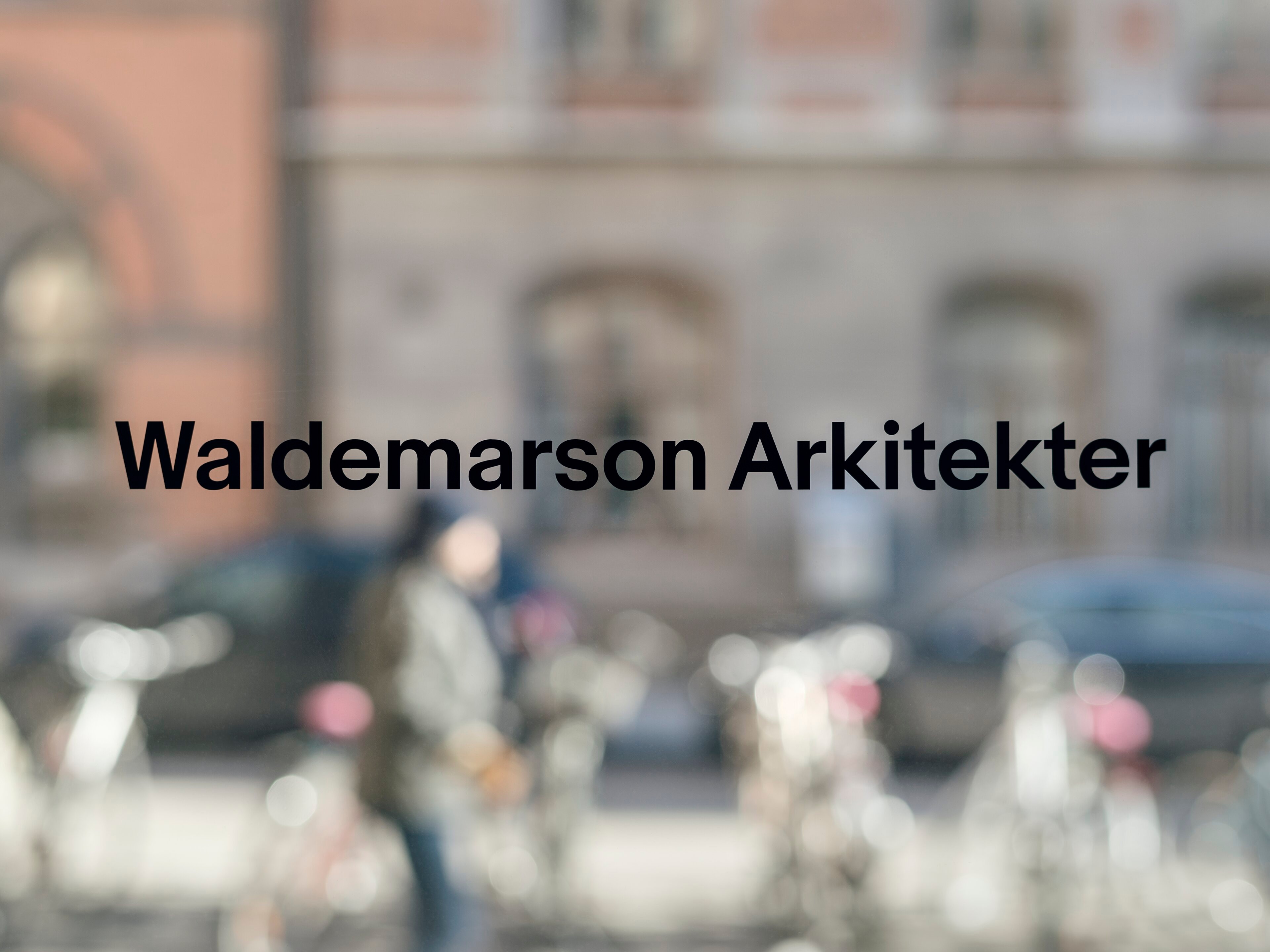
Waldemarson Arkitekter. Structure to the core.
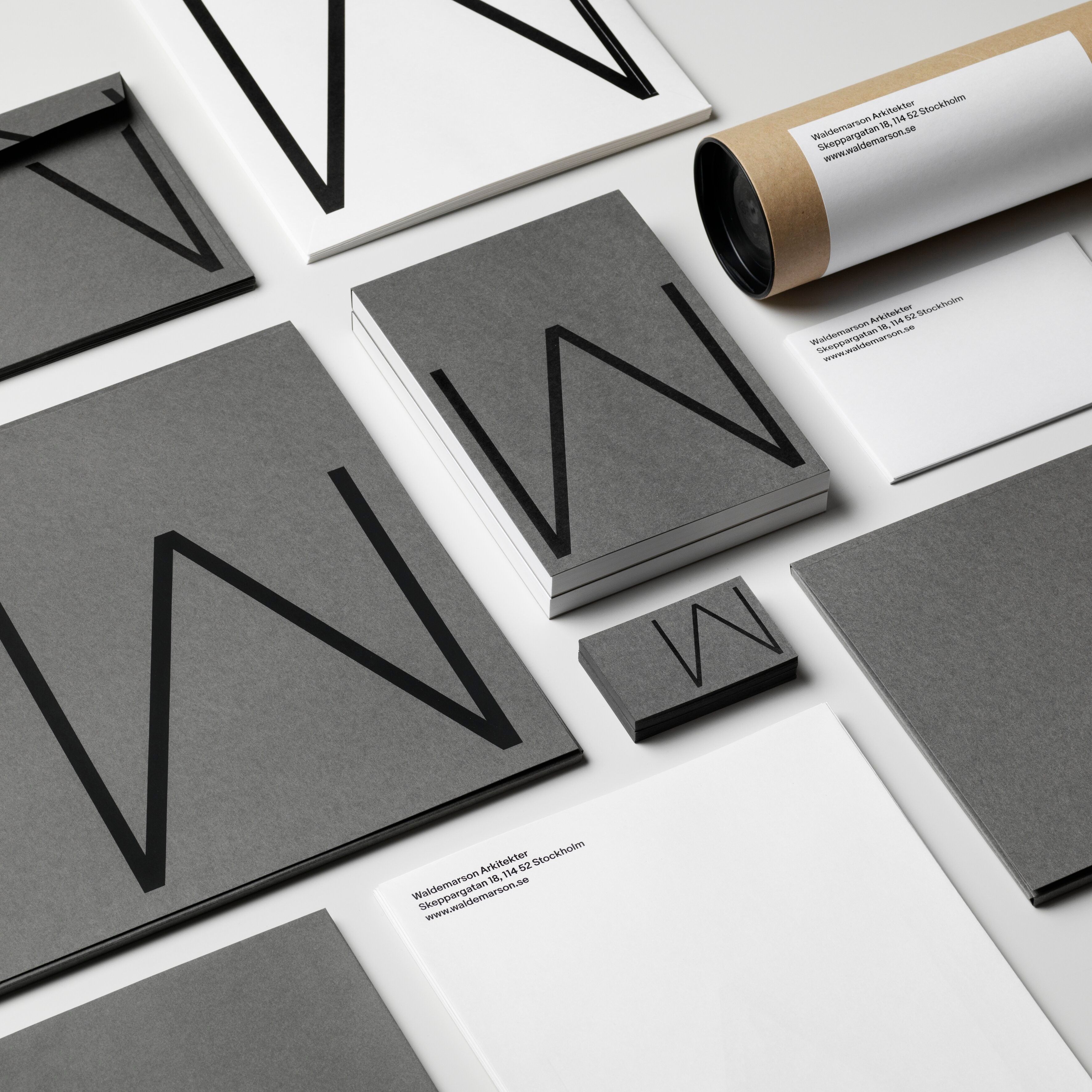
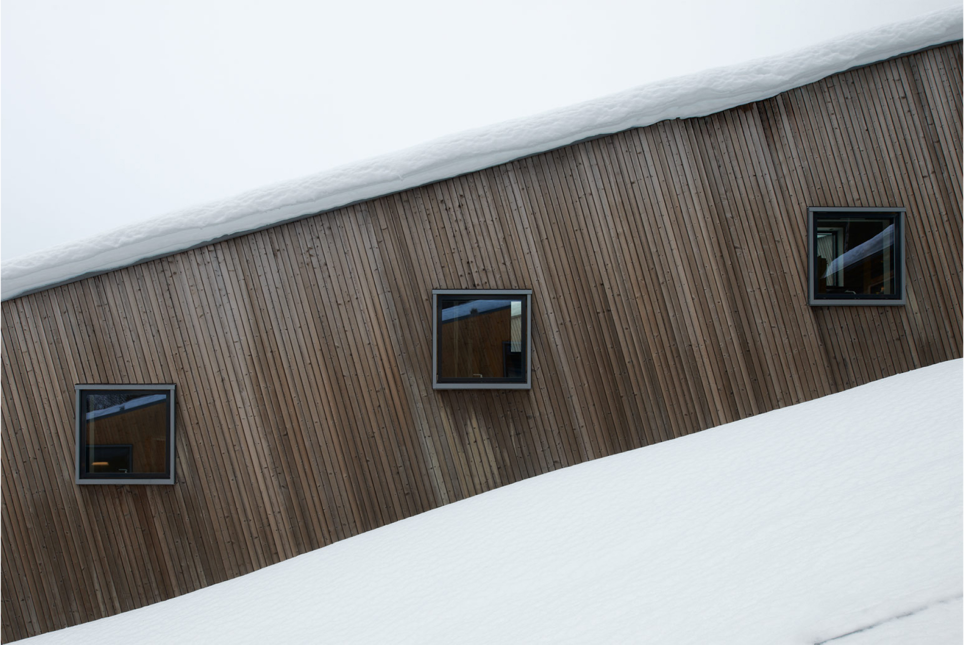
The identity for Waldemarson Arkitekter is as distinct as it is functional, a responsive design system which adapts to the proportion and purpose of each communication piece and medium. It is built to allow for consistency and ease of use through all communication. The firm’s modernist approach to architecture, with references to, for example, Mies van der Rohe, formed the basis for the visual expression.
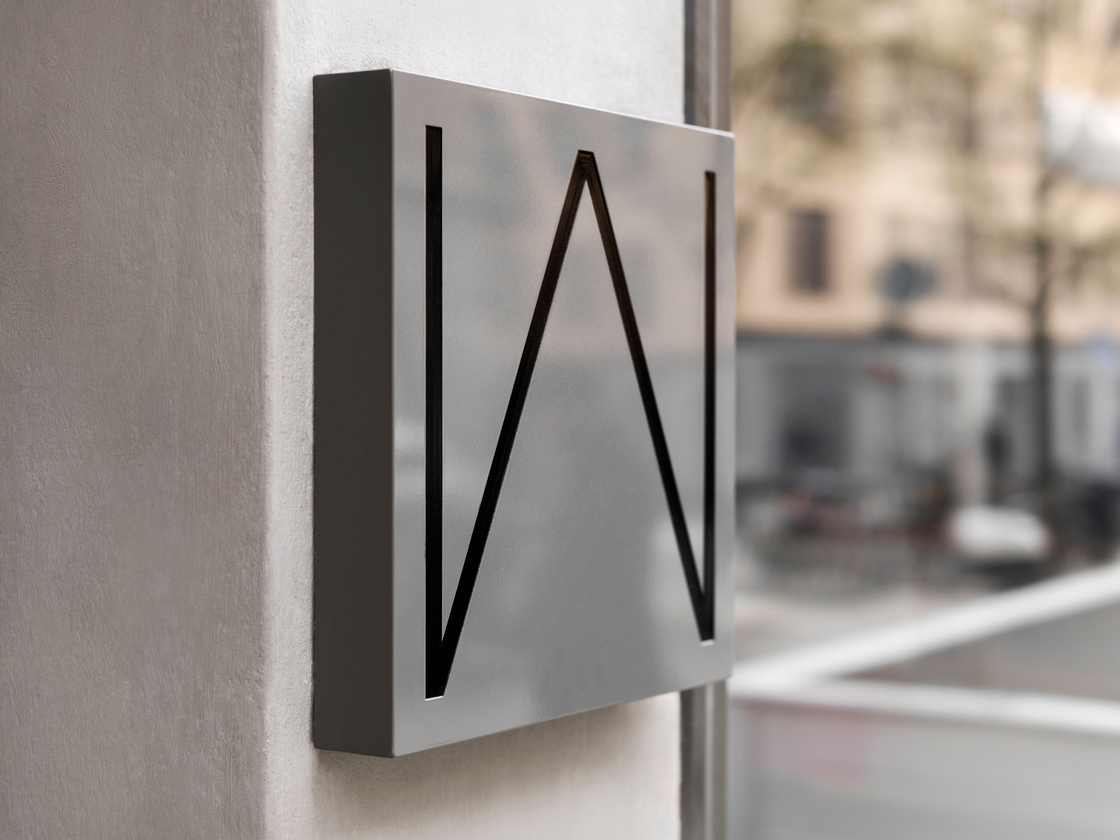
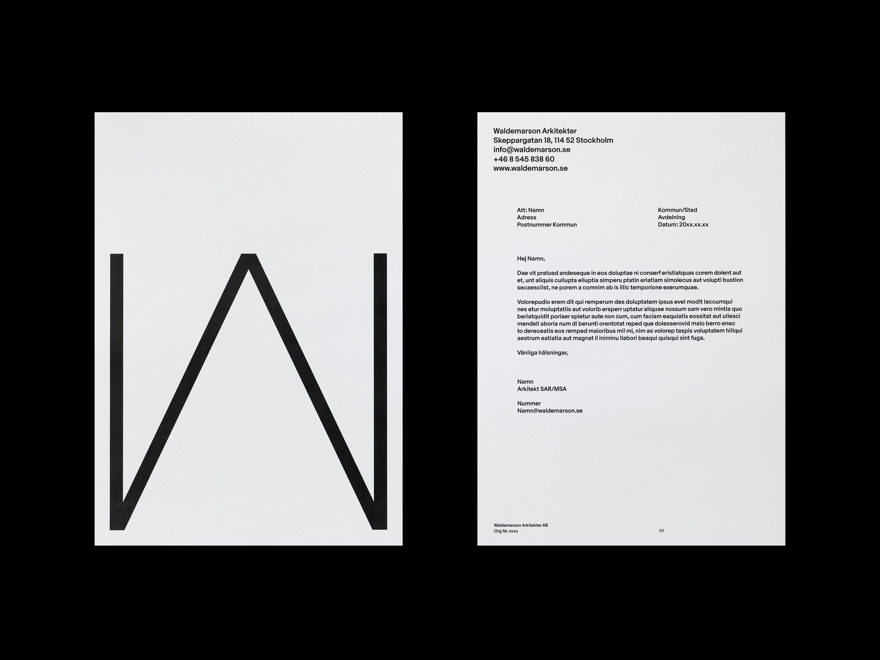
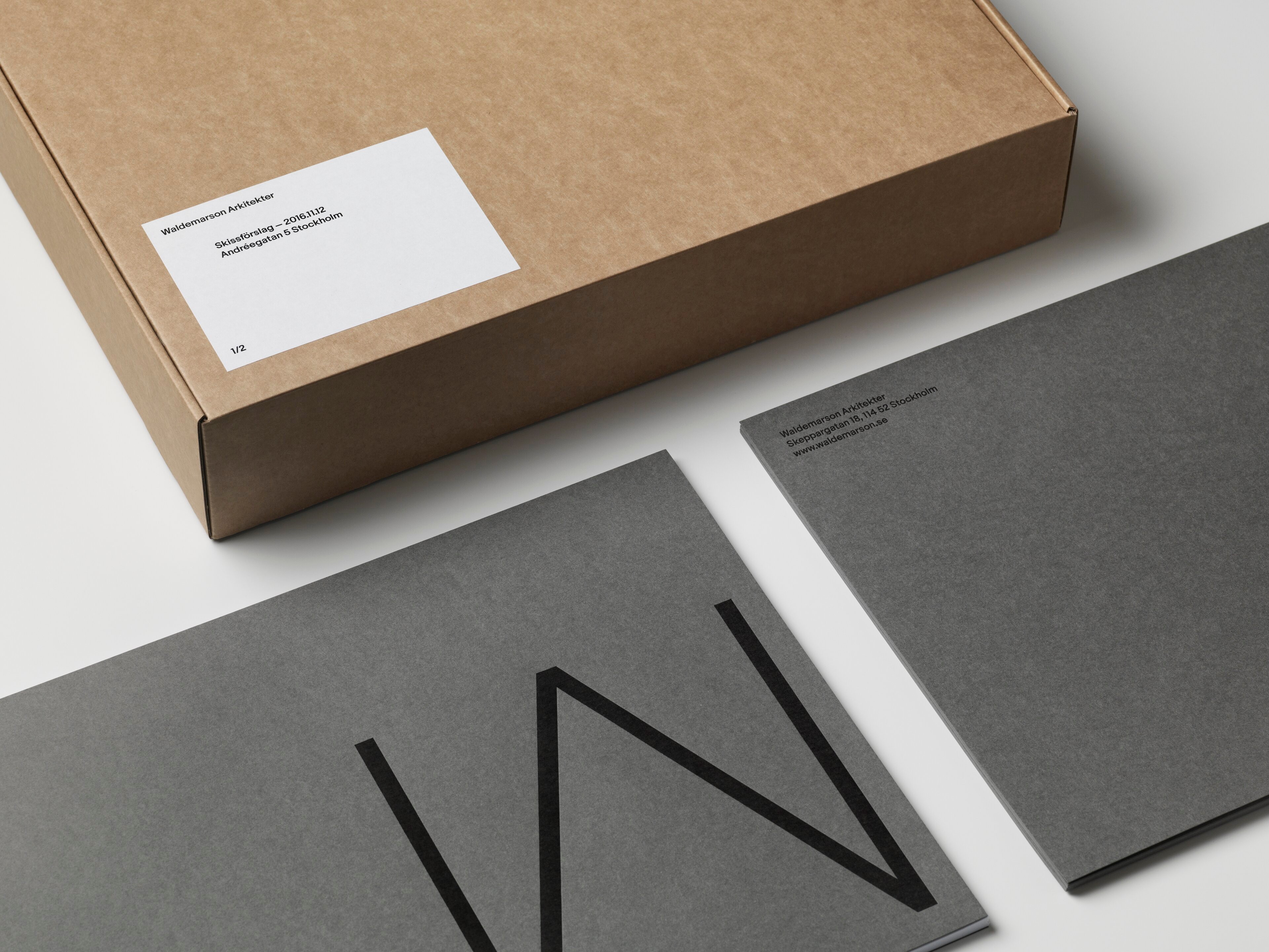
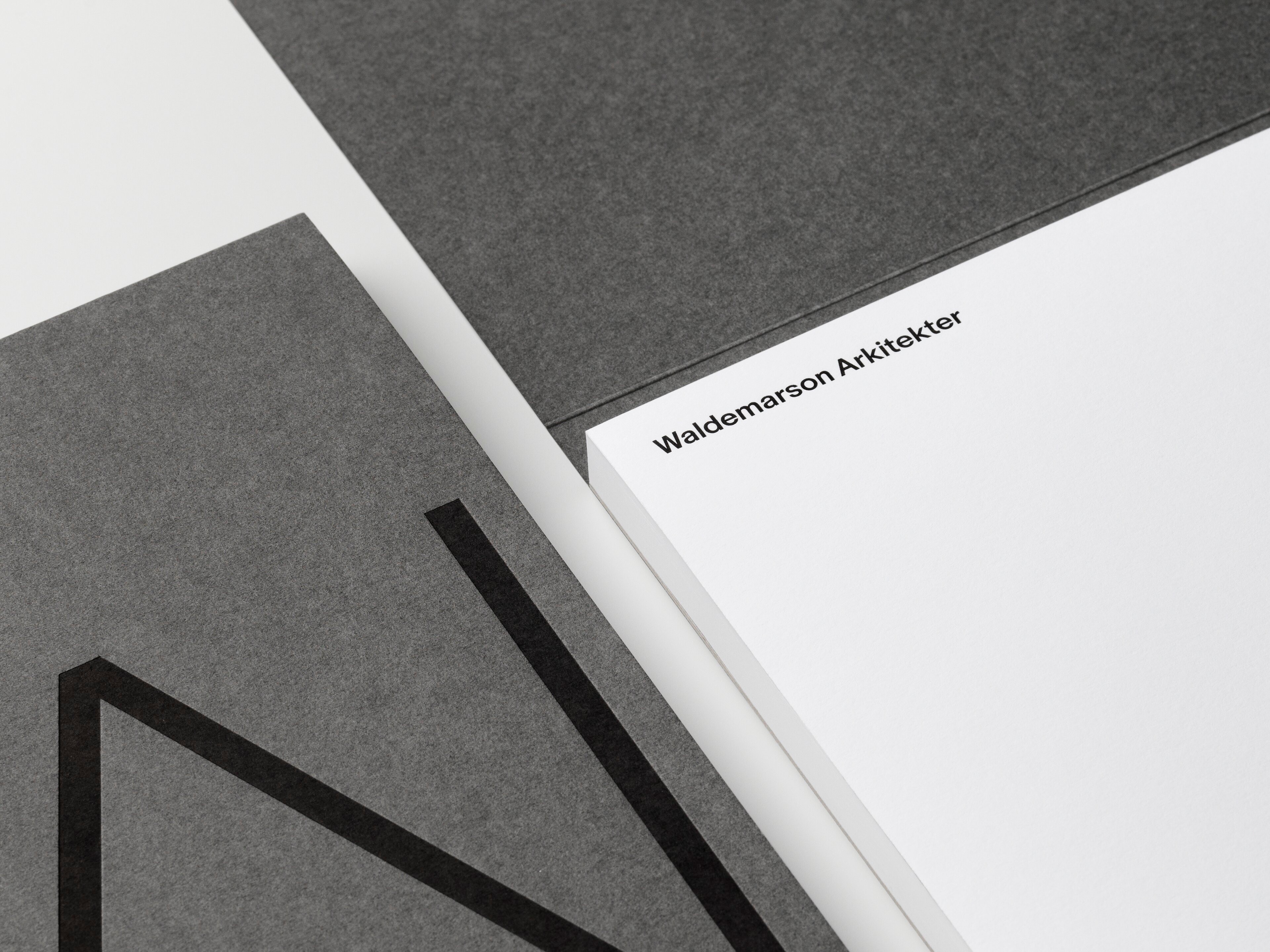
The idea behind the symbol combines the W and A into one unified shape which references a truss, a common structural form within architecture. It is boldly applied to the applications giving the identity a distinct architectural expression. The typographic grid reflects modern architecture’s principles of asymmetrical balance. Applications included everything from stationery and printed matter to company presentations, digital templates and website as well as signage, tote bags and other material.
IdentityPrintSignageWebsite
waldemarson.se