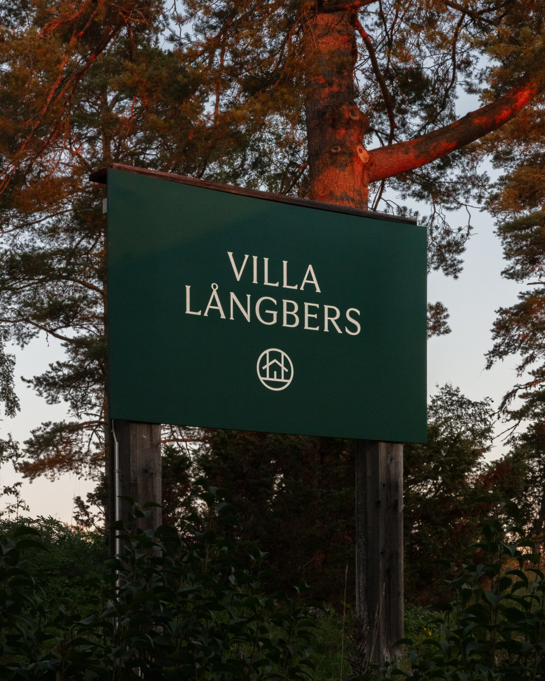
Tällberg Hotels. Among fonts and folklore.
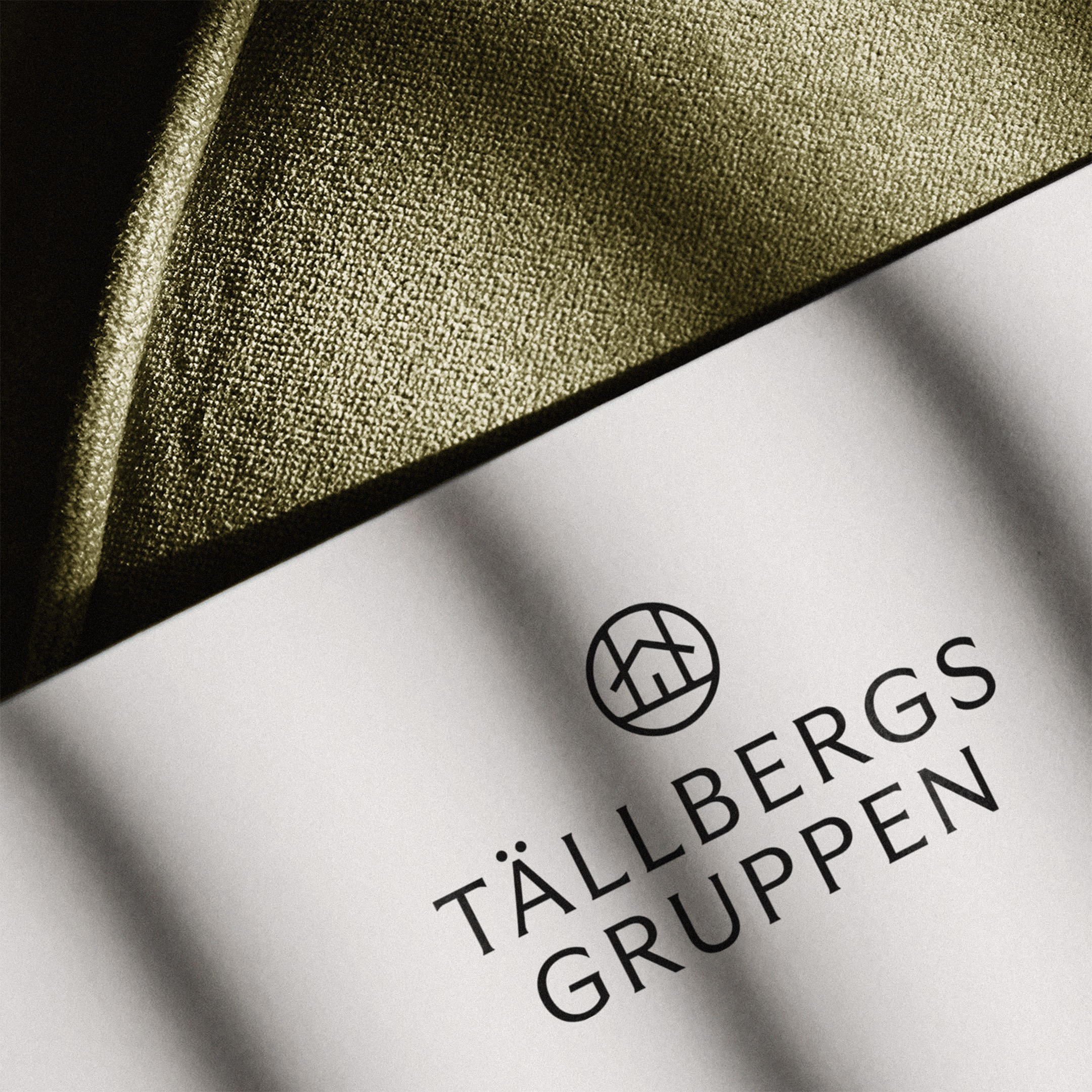
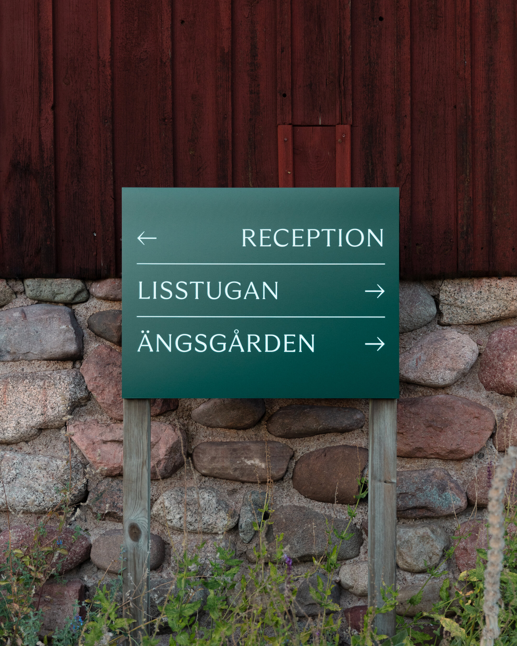
When The Studio was asked to create a new identity system for one of the main hotel groups in the classic Dalarna resort town of Tällberg, Sweden, the challenge was to create unique identities for each of the hotels, while at the same time establish a visual link between them, and the mother brand.
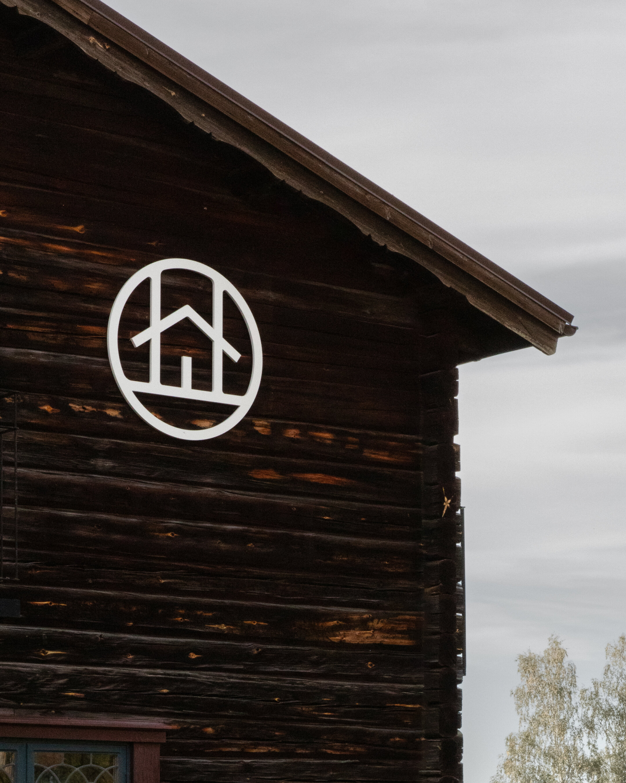
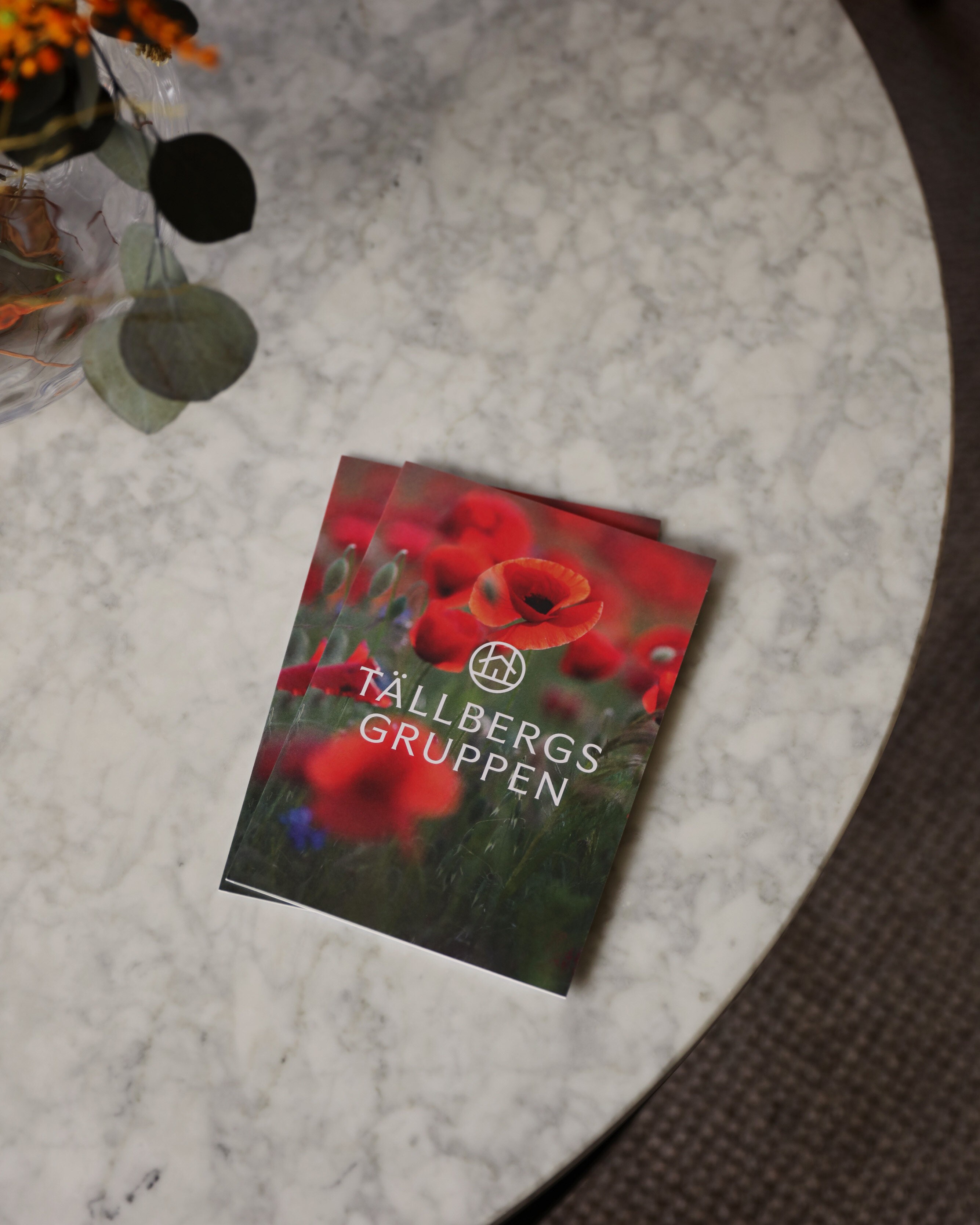
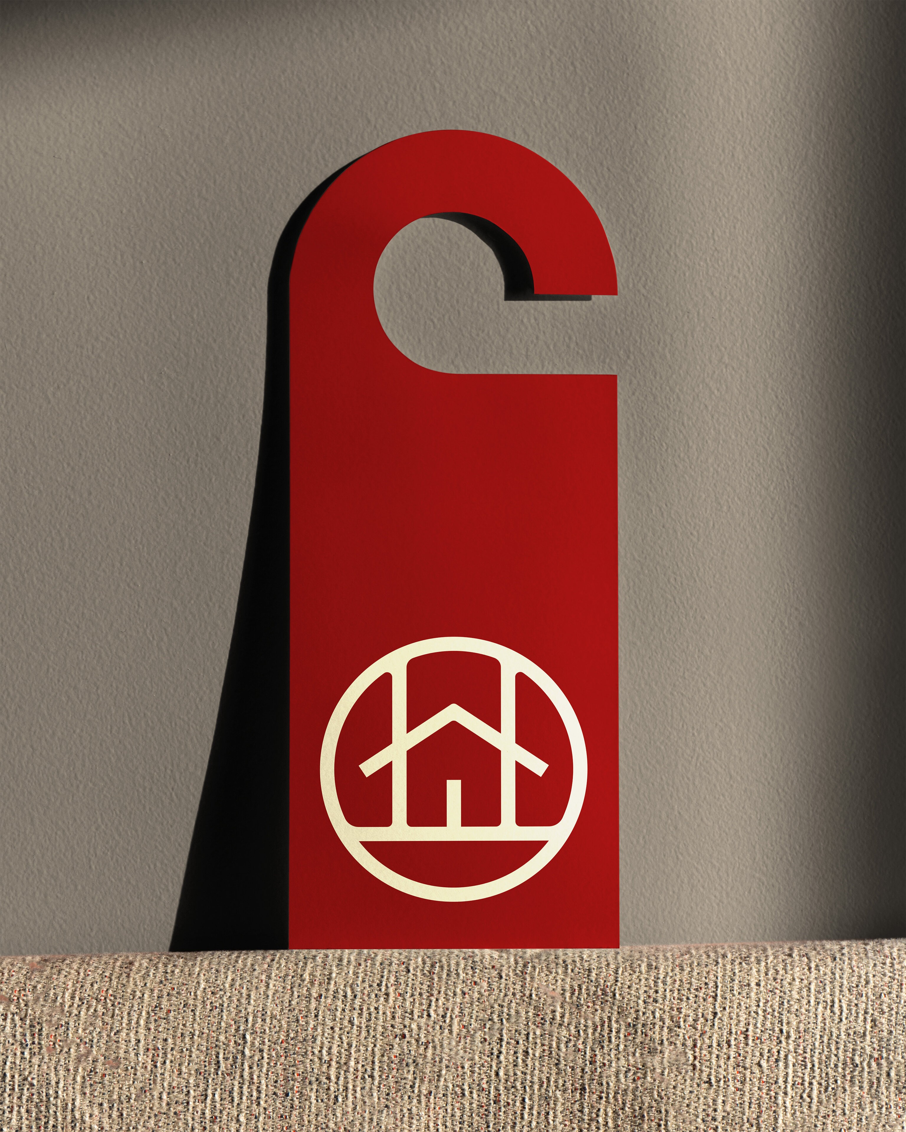
Our solution was to use the same typeface for all wordmarks but using different cuts, weights and handling. Each wordmark is paired with the same unifying symbol for the hotel group, set in the same configuration, but has a unique character that reflects the specific niche of each hotel. The shared symbol is being used across all hotels for anything from staff clothes to stationery and robes.
IdentityArt Direction DigitalPrint
Guidelines
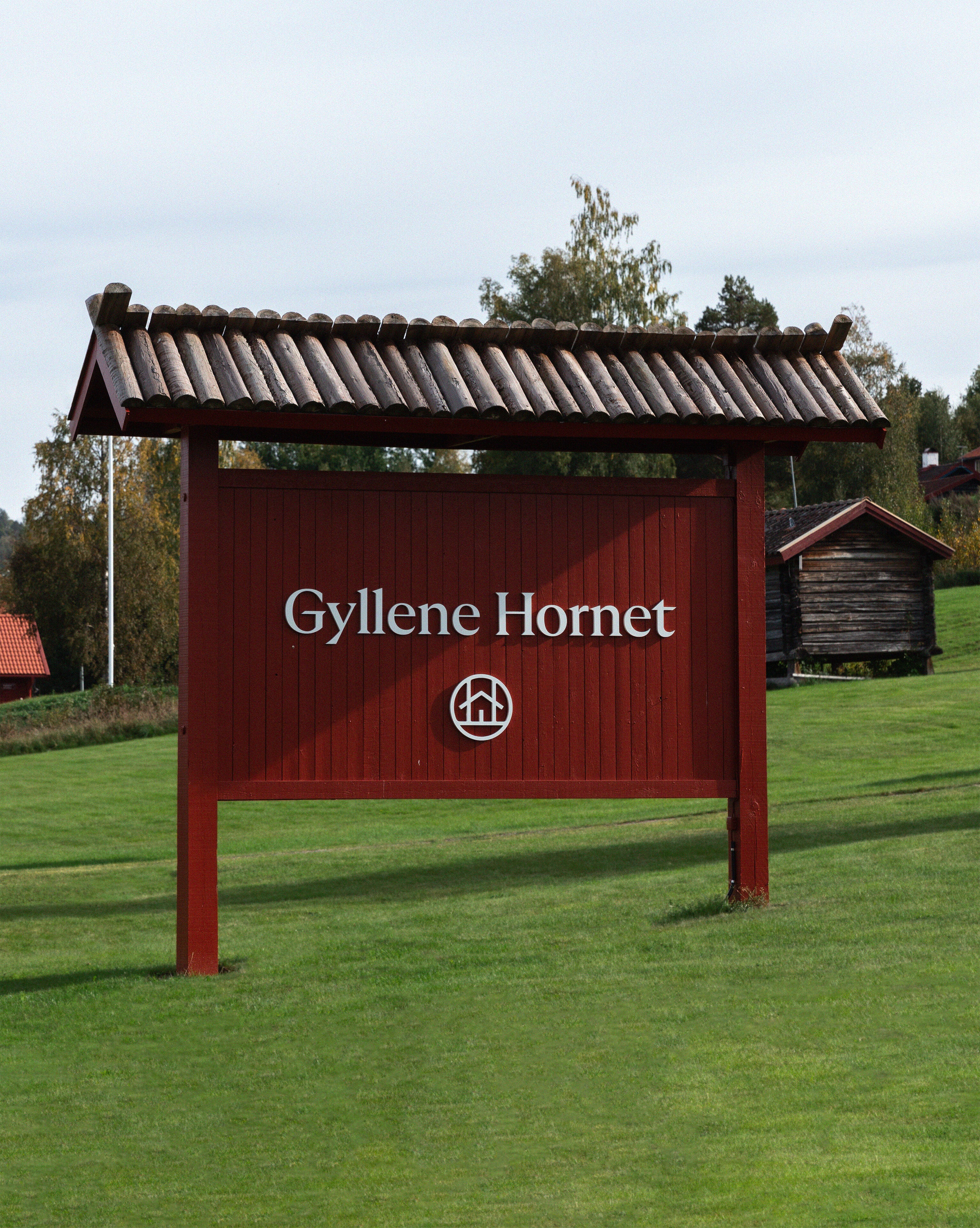
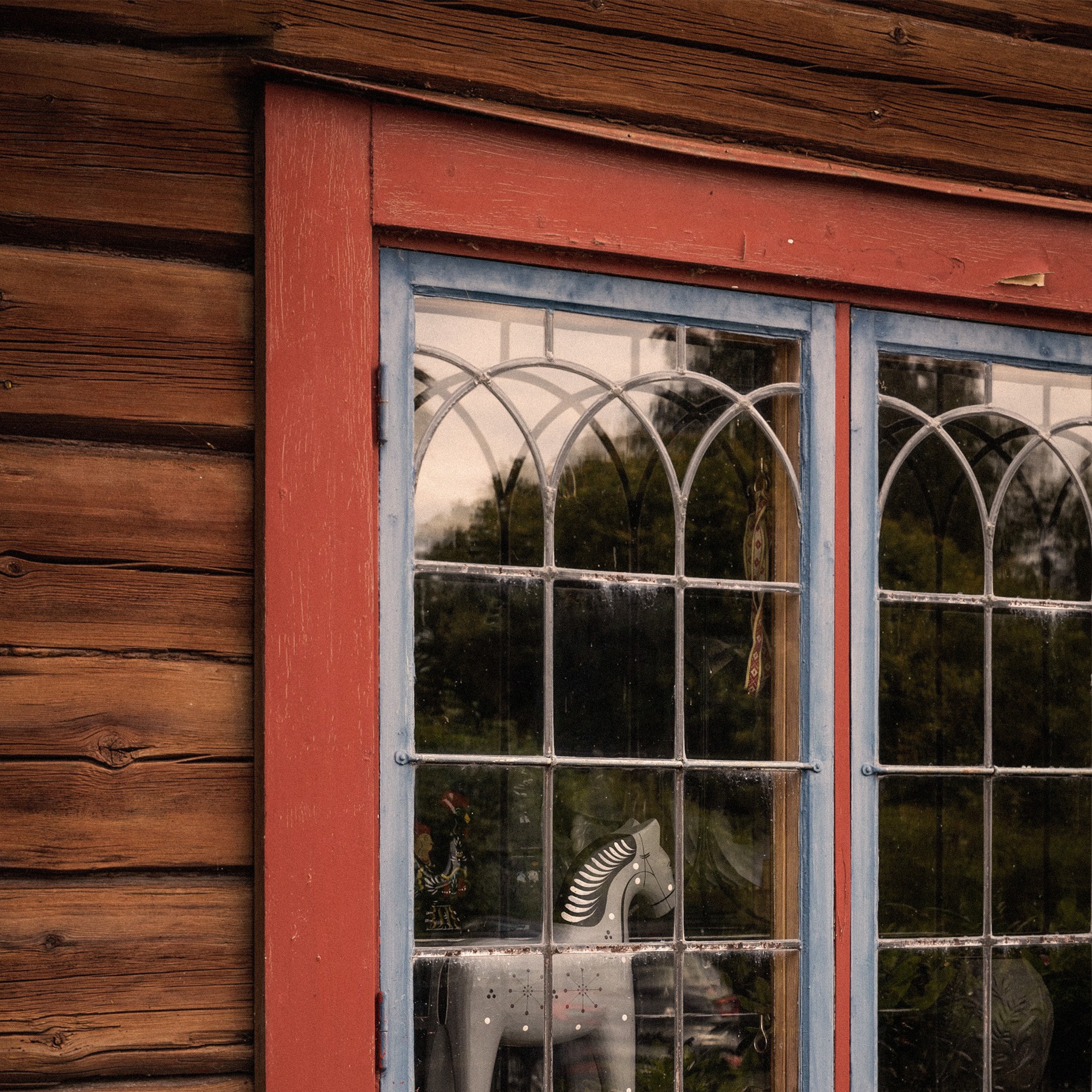
The idea for the symbol was inspired by traditional “house marks”, once used by farms in Dalecarlia to identify their property. Each mark was carved by hand into the timber walls of the houses.