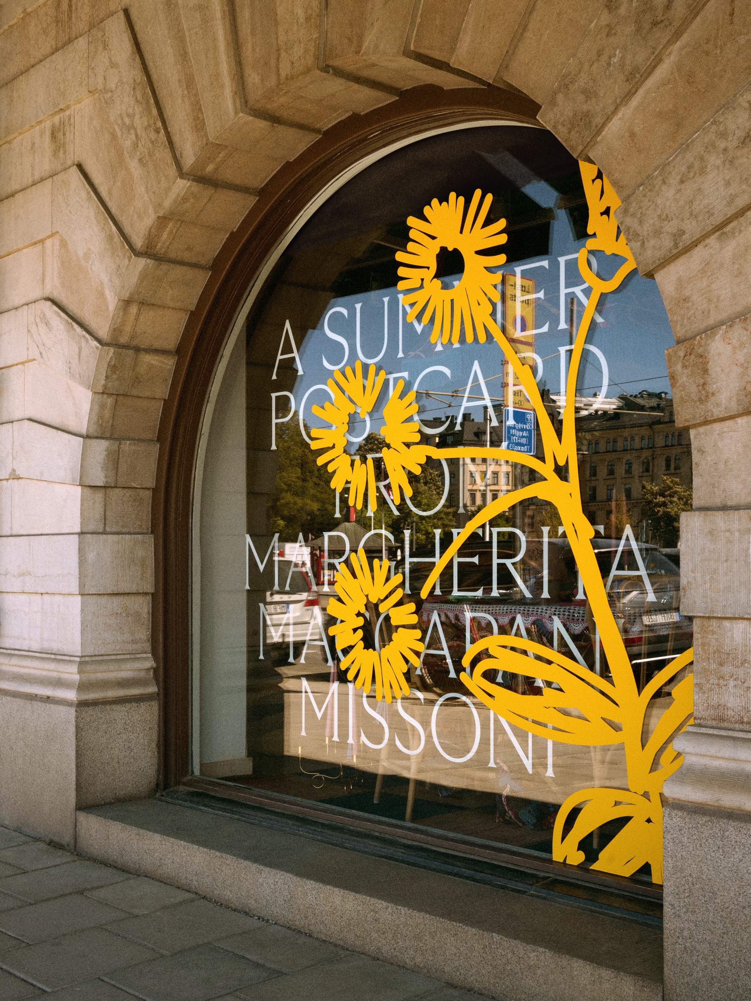
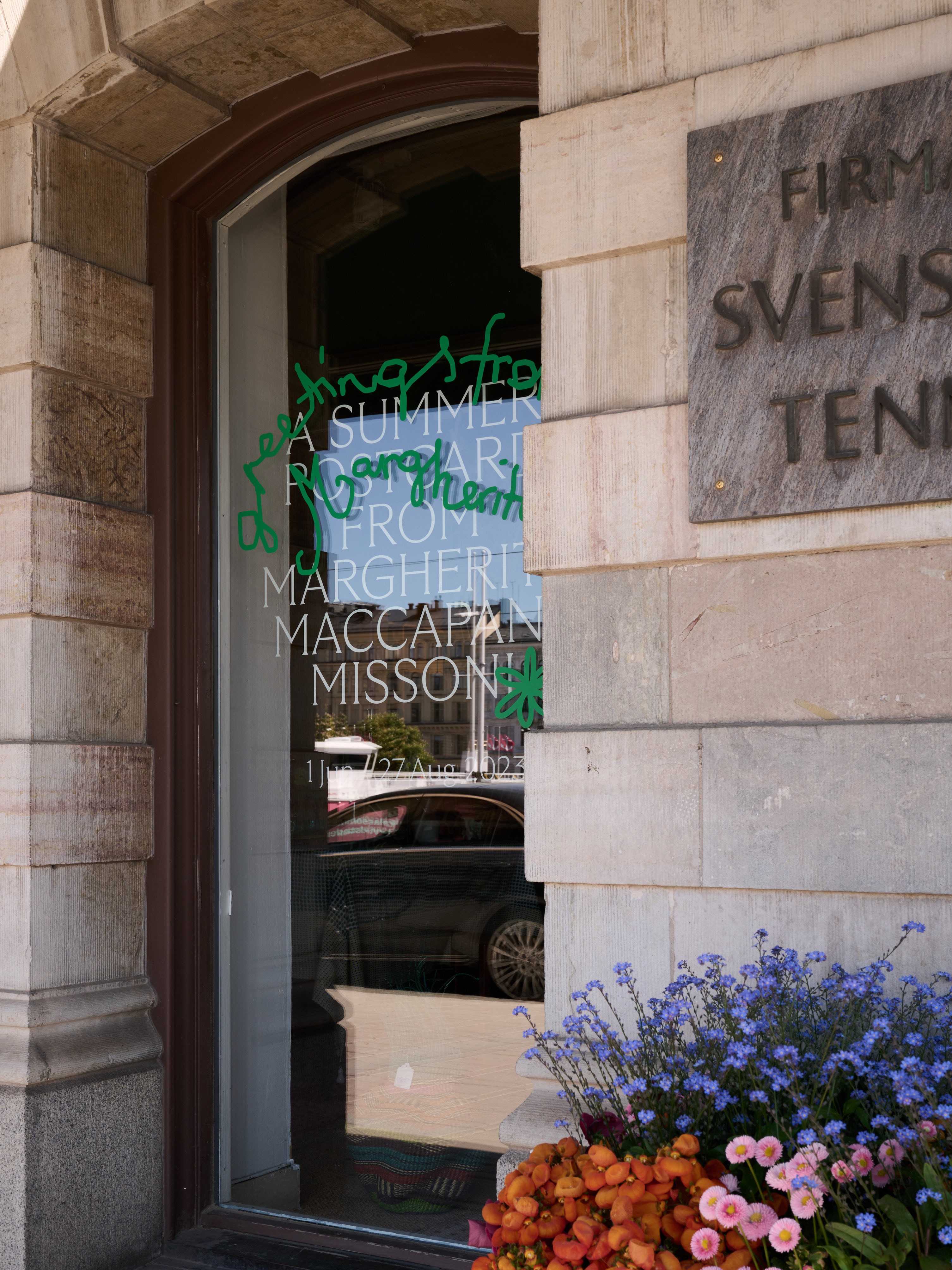
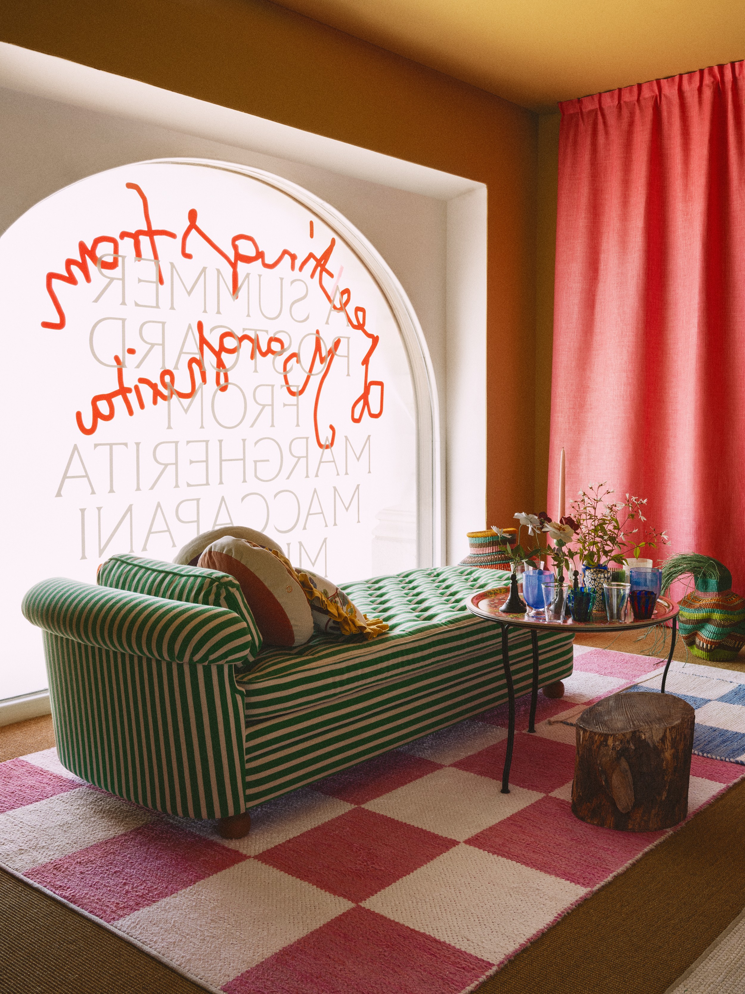
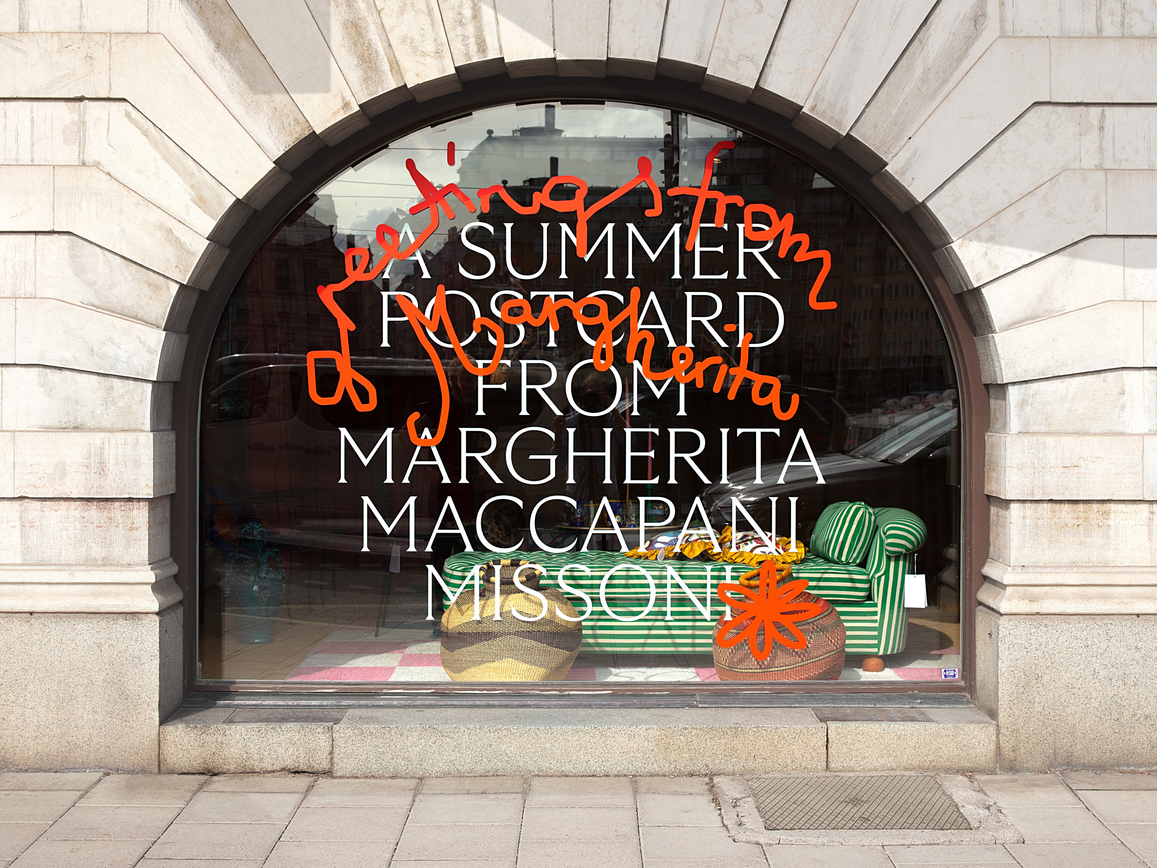
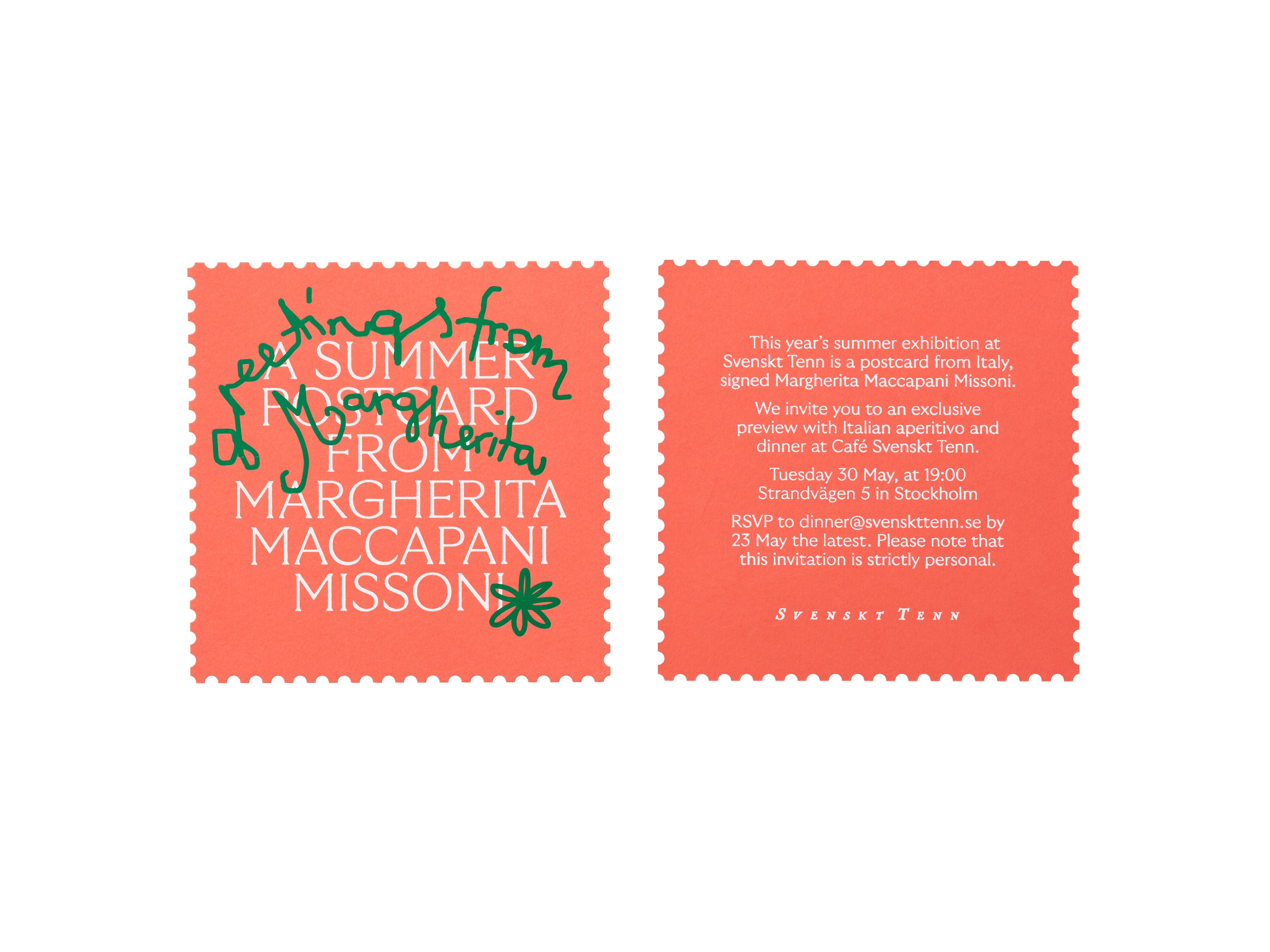
Svenskt Tenn. A postcard from Italy.
IdentityCampaign DigitalMotionPrint
Exhibition
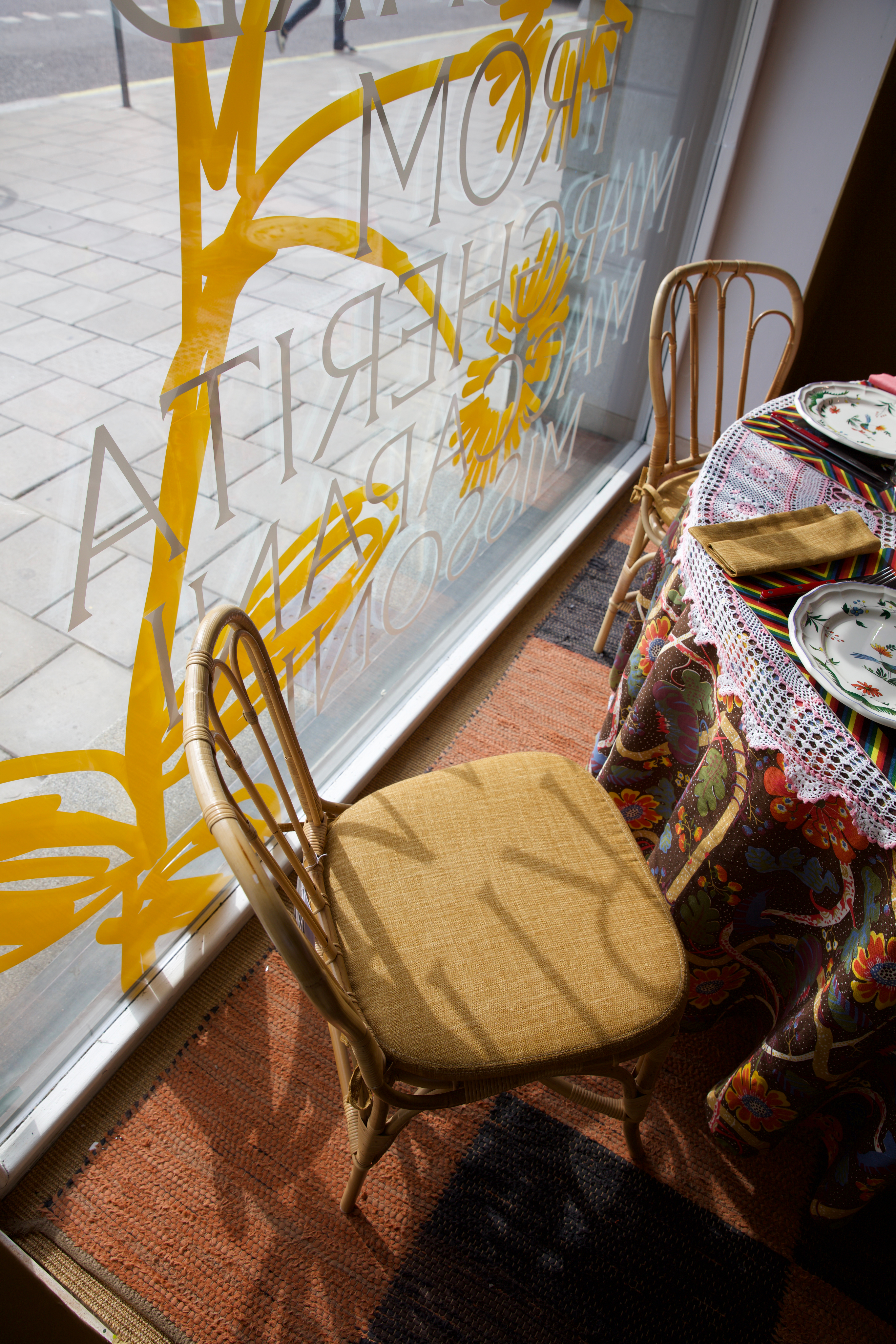
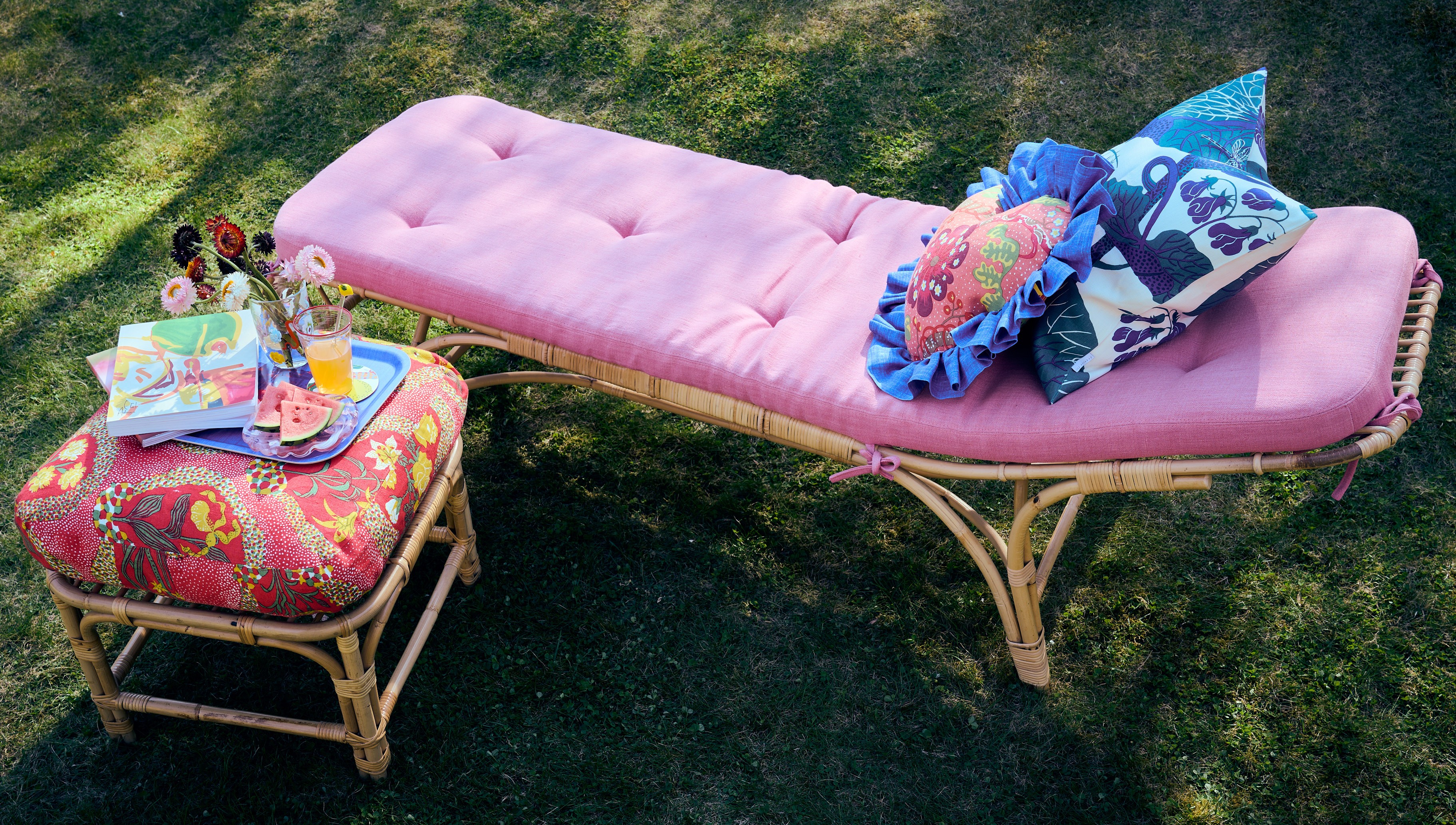
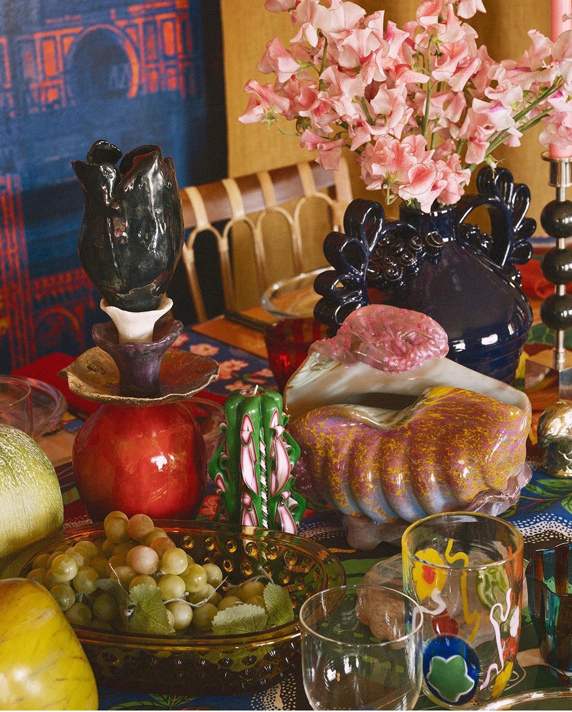
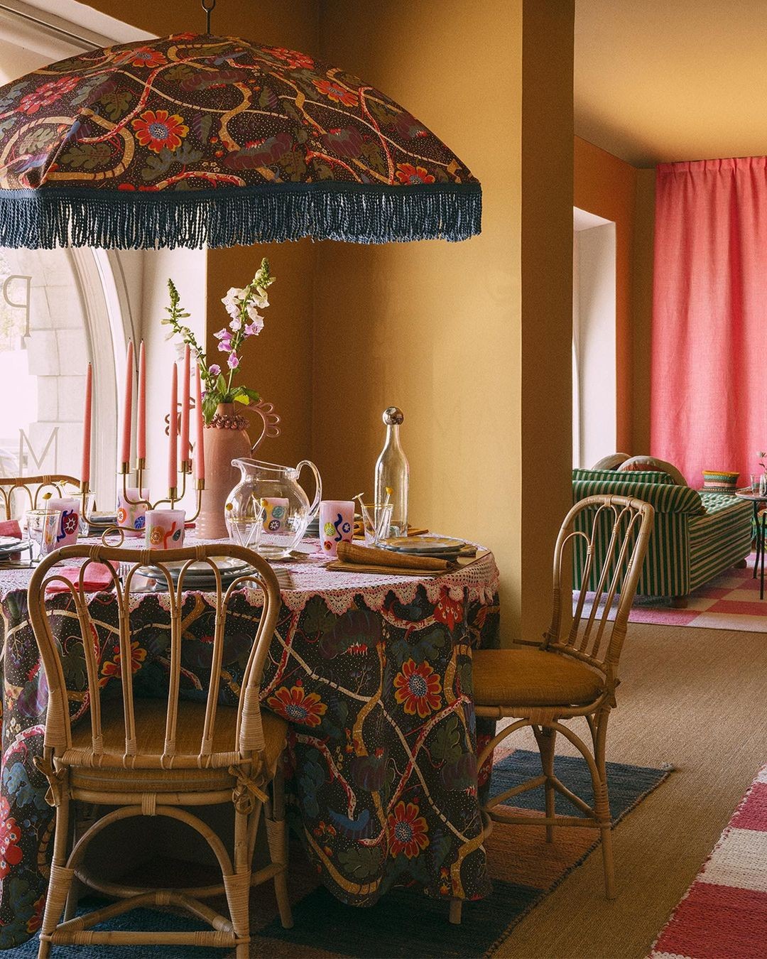
The renowned Swedish furniture producer and interior company Svenskt Tenn was founded in 1924 by Estrid Ericson. Together with Austrian-born Josef Frank, they formed their characteristic personal style which is as modern today as it was in the 1930’s. With an eclectic collection of objects, tableware and furniture, Margherita dials up the patterns and colours of design legend Josef Frank. Freely combining new products with old, stripes with prints, ruffles with crochet table cloths all with a good dose of irony. A modern curation of play.
Our concept for the campaign was inspired by Margherita's free spirited Instagram world of hand scribbled greetings and doodles balanced with the classic elegance of the Svenskt Tenn brand. Whimsical invitations mixed with animated doodles on digital media set the tone. The campaign was made to appeal to loyal customers, while sparking interest with a younger audience.
The Studio was able to capture the casual free spirit of Margherita’s style while maintaining the integrity of the Svenskt Tenn brand. — Tora Grape, Head of marketing
Margherita’s name means marguerite or daisy and is a common element in her work.
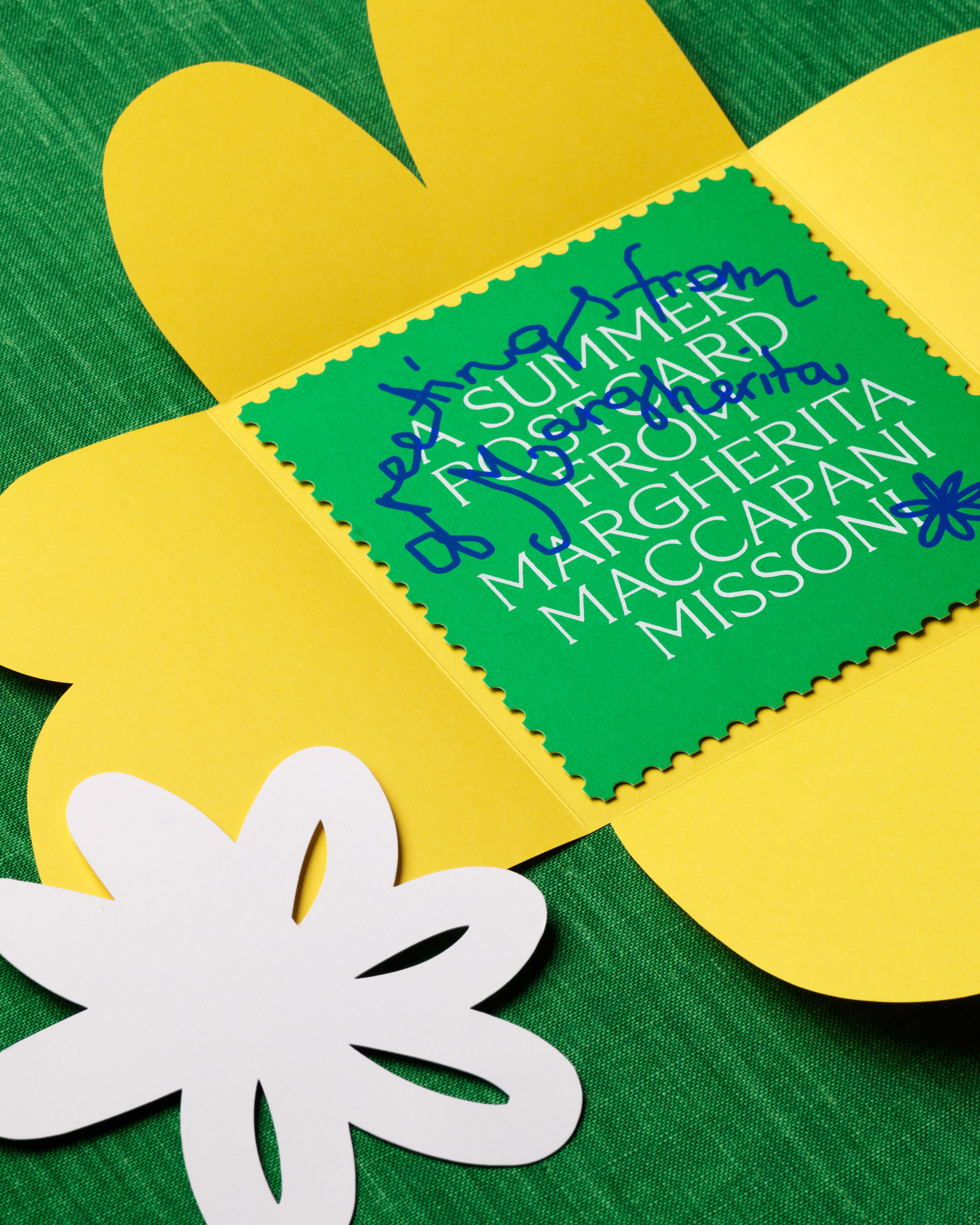
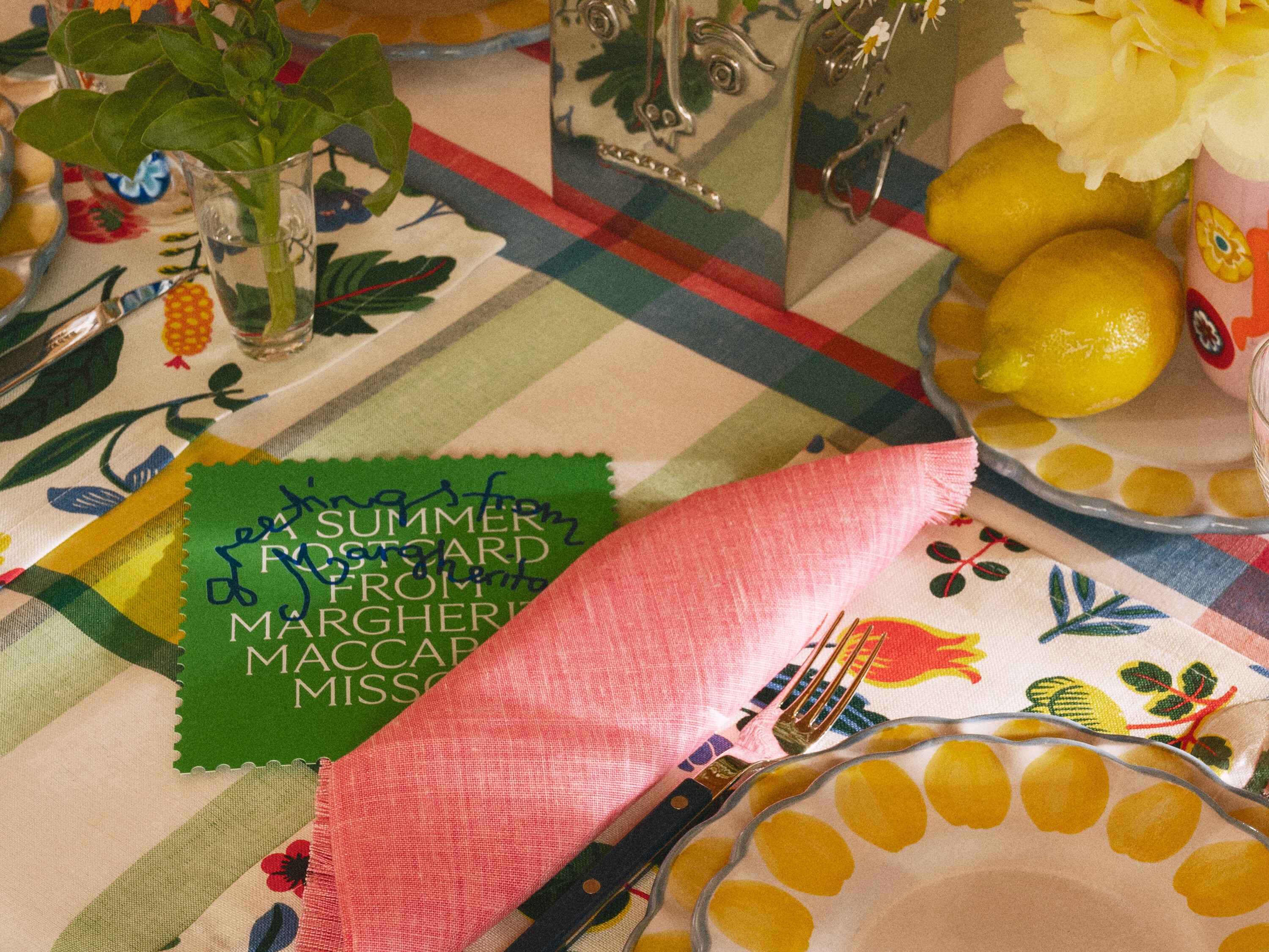
The summer invitation’s envelope was a huge flower which unfolded like a picnic blanket to present the postcard invite sprinkled with paper daisies.
svenskttenn
svenskttenn
The project included the design of a campaign logotype, print and digital invitations, window decorations as well as social media ads and animations.