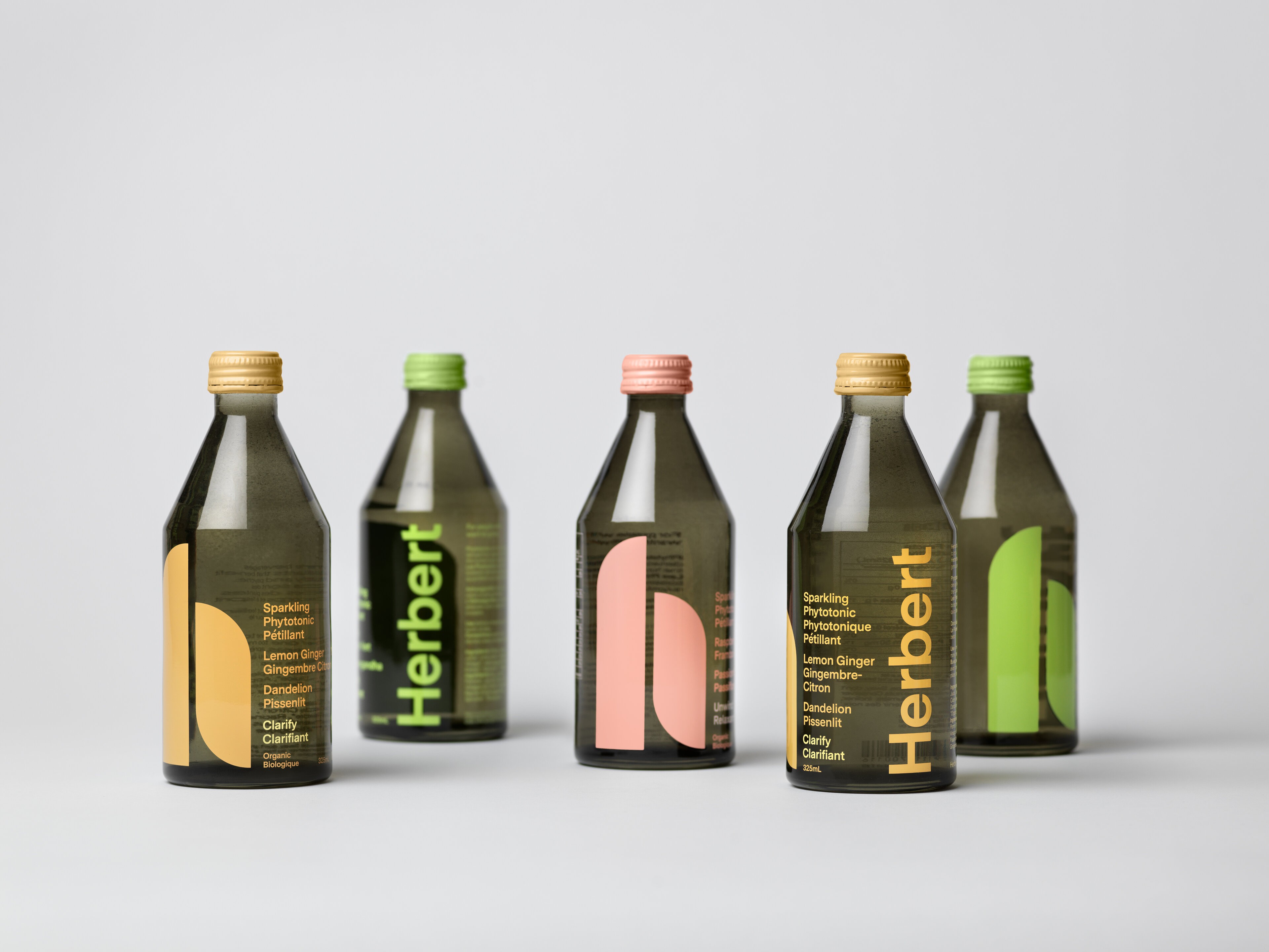
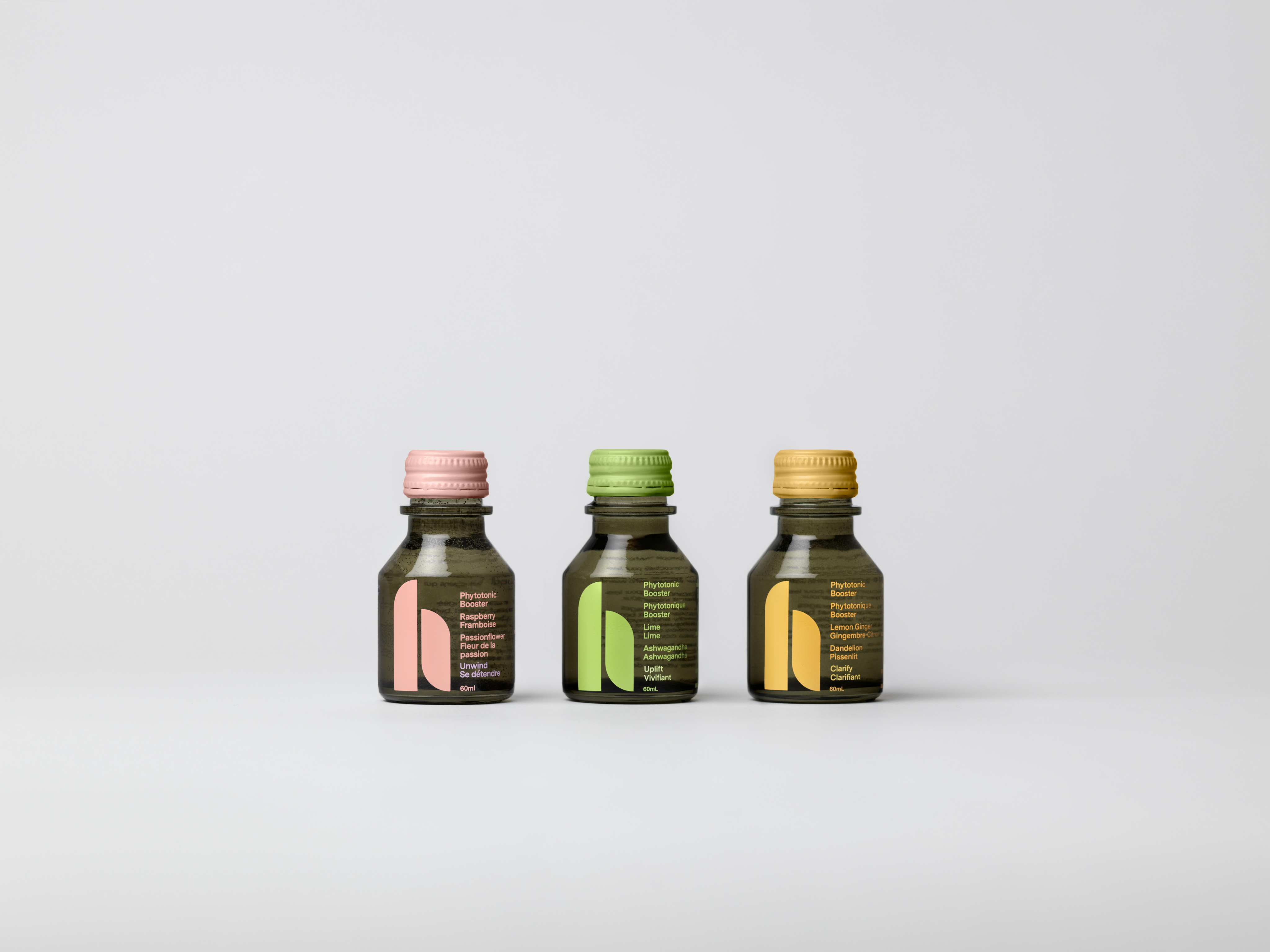
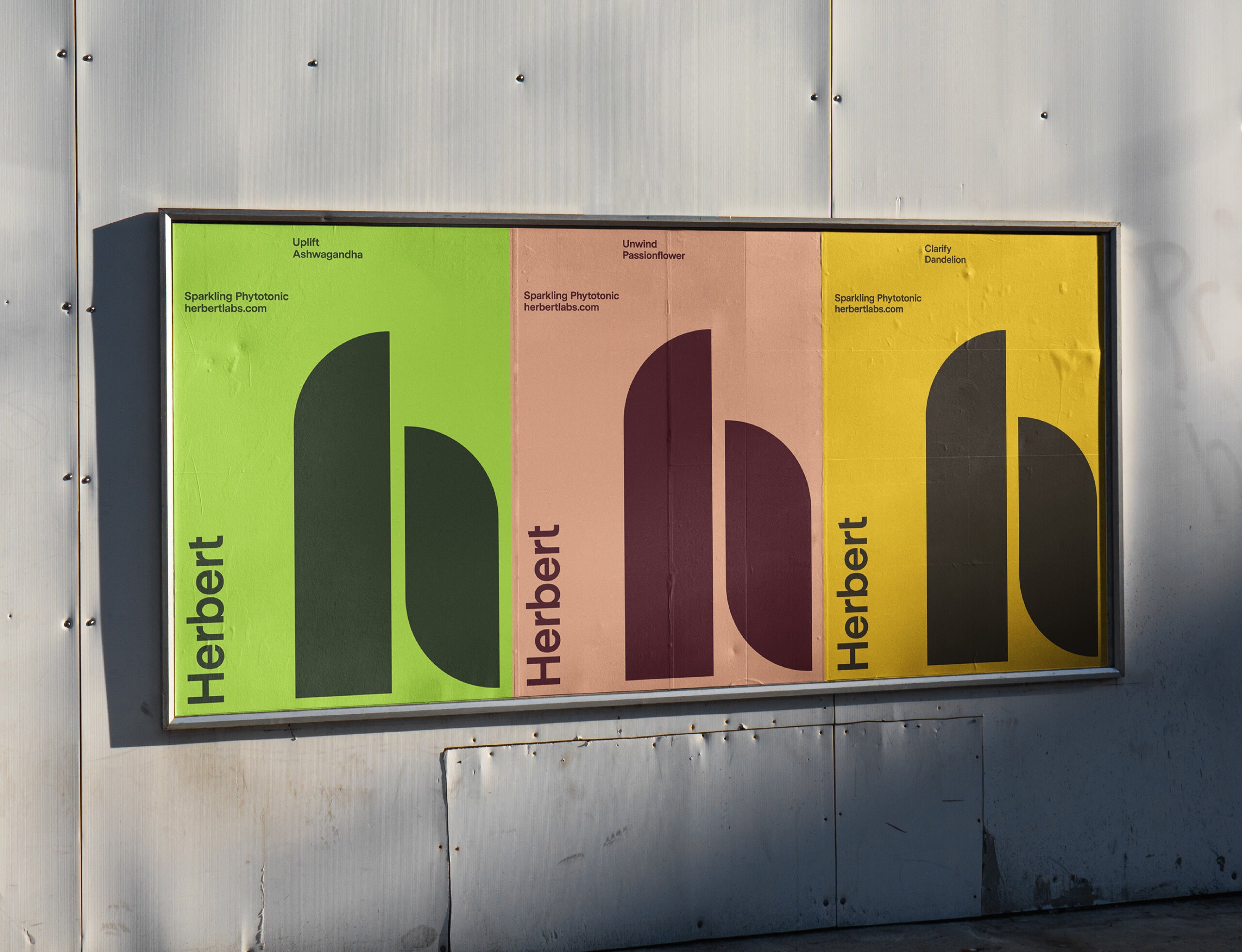
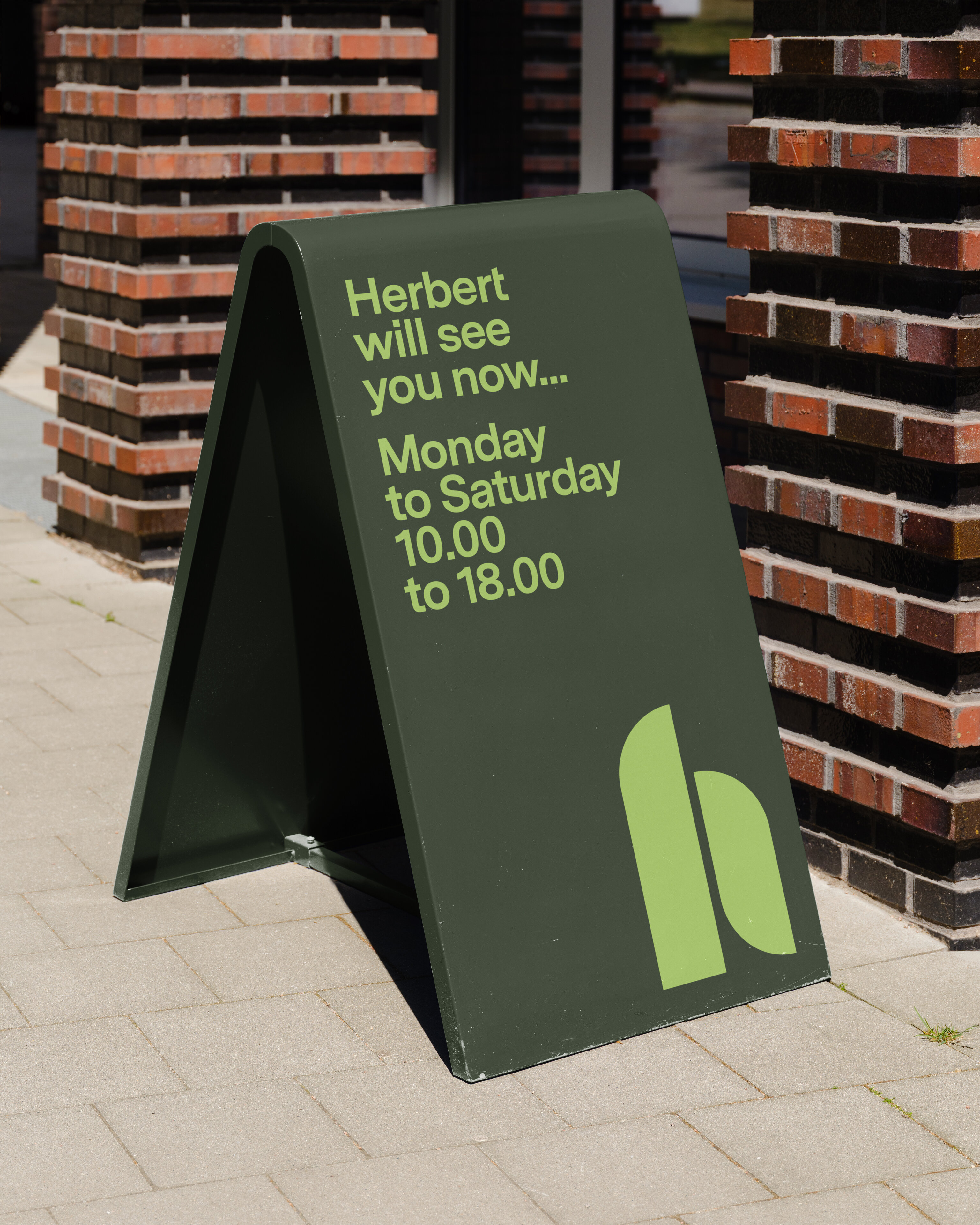
Herbert. Sparkling phytotonics.
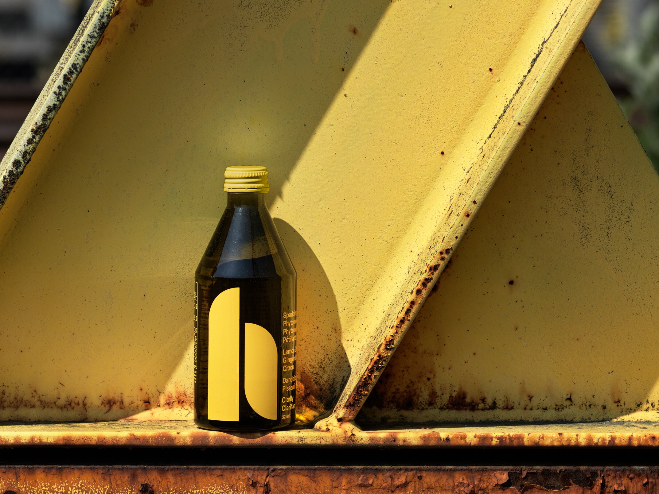
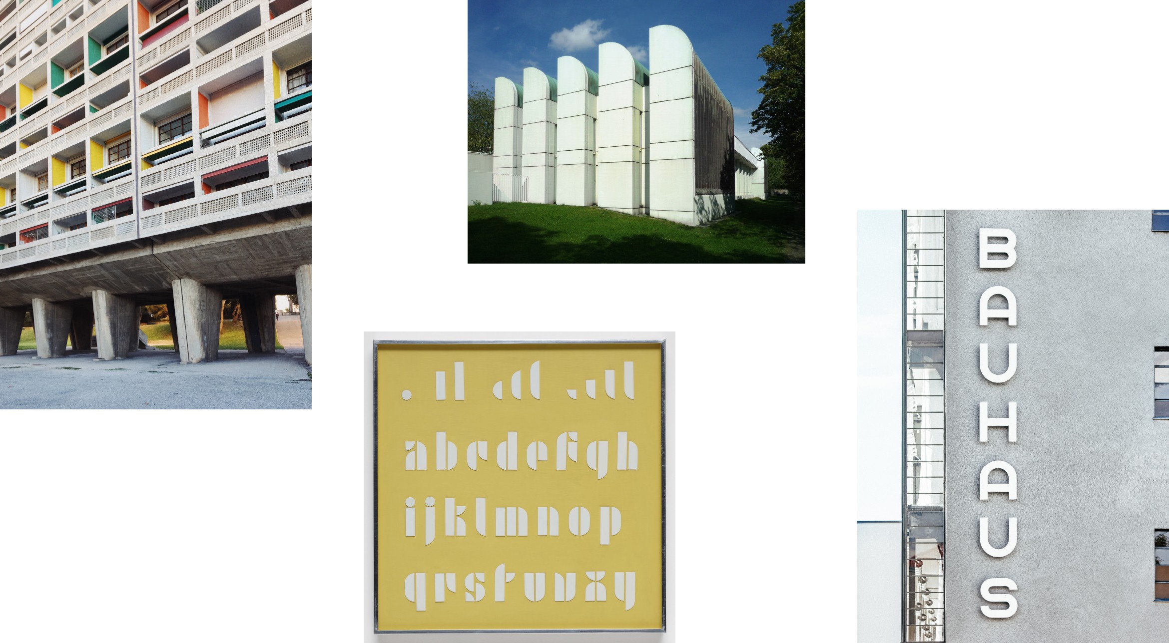
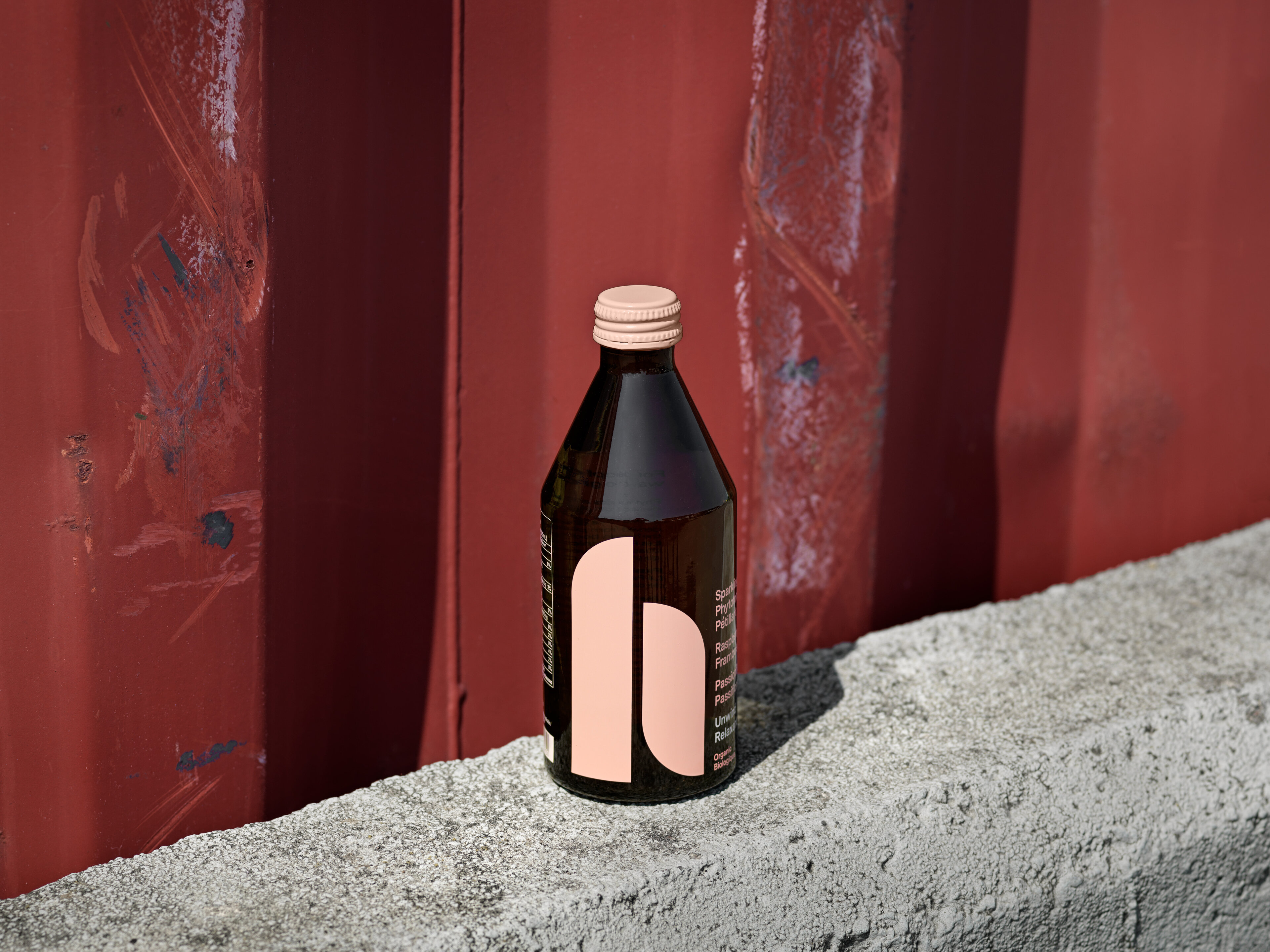
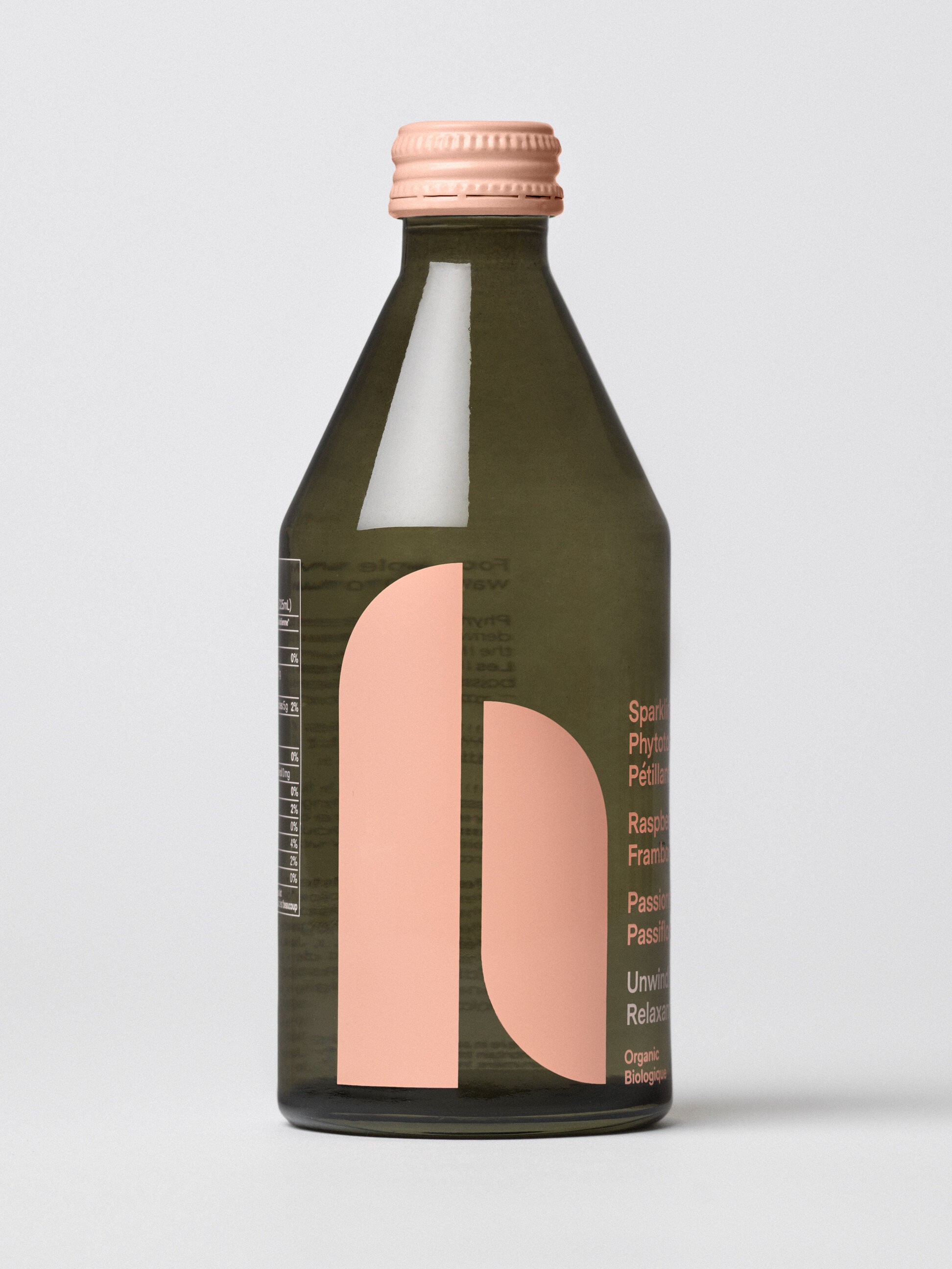
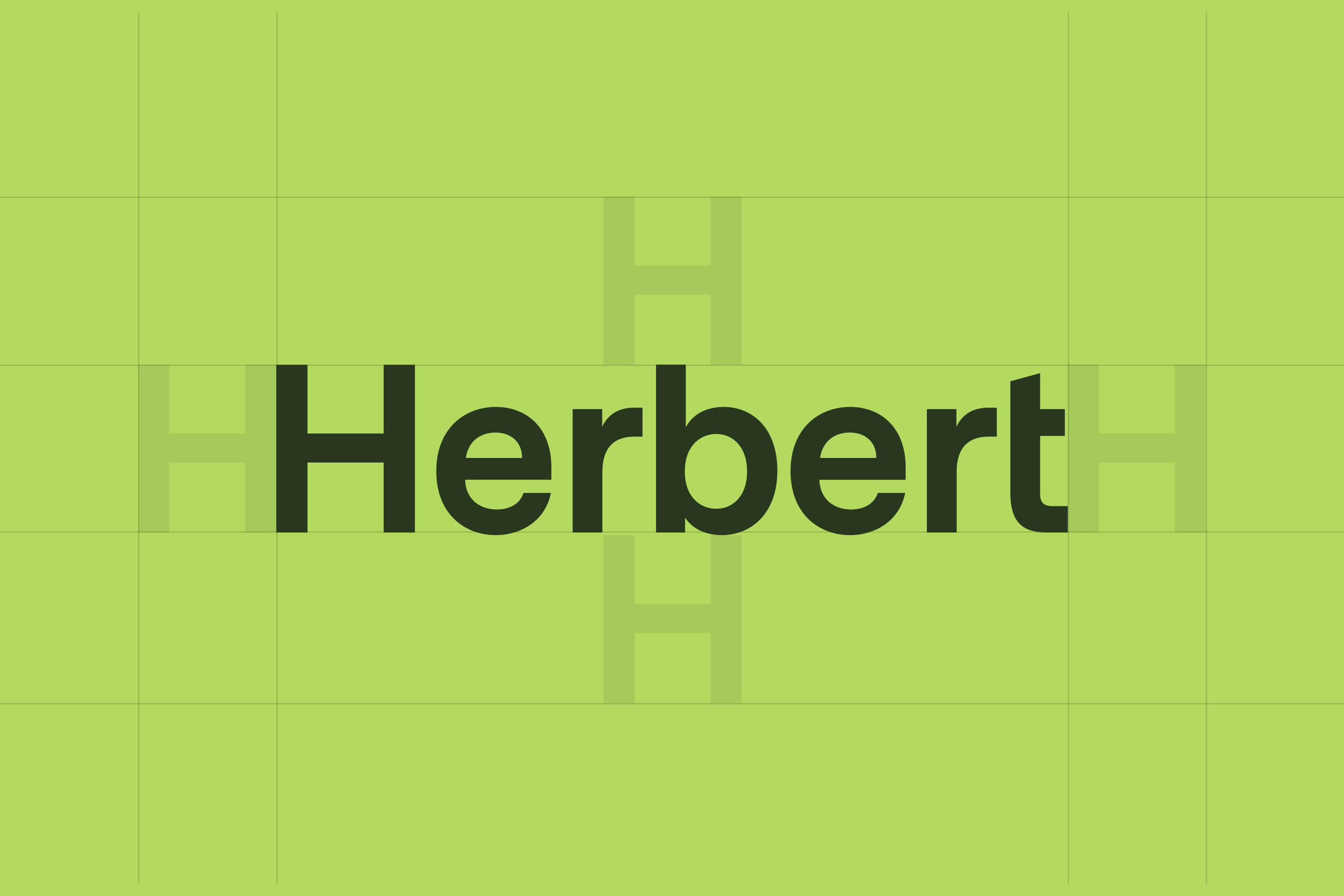
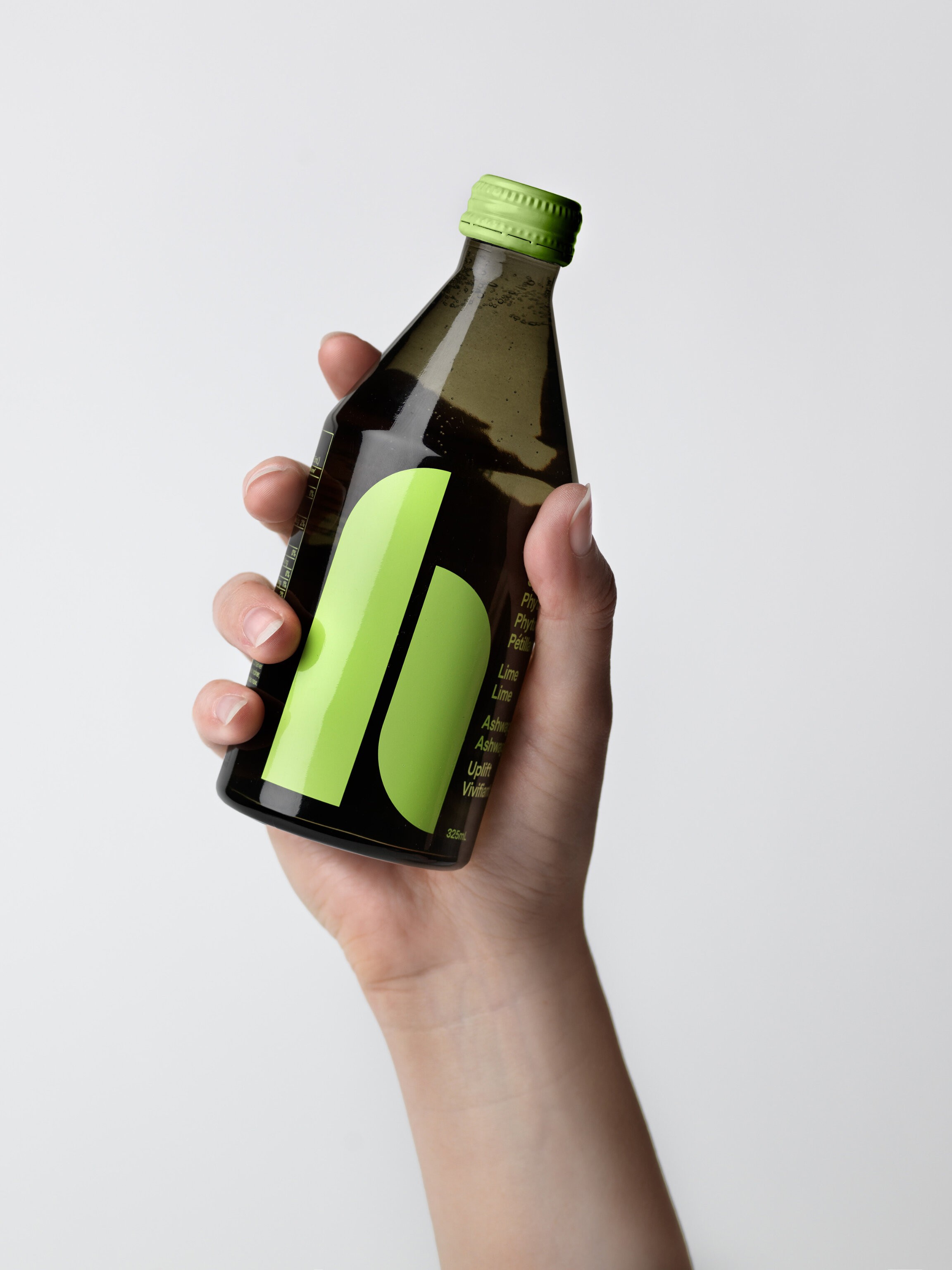
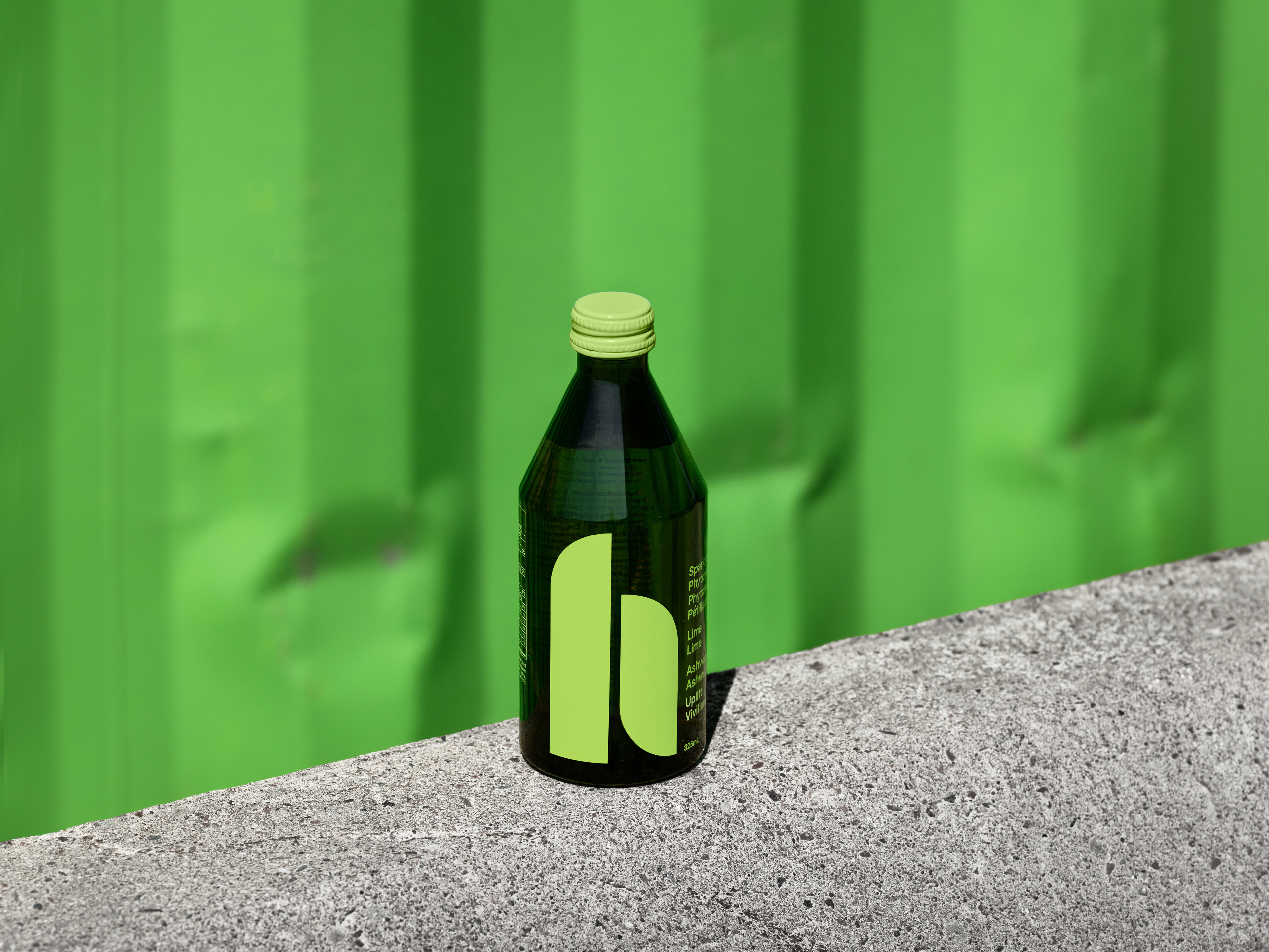
Graphic identity and packaging design for phytotonic beverage brand, Herbert, derived from plants that benefit the body and psyche. The starting point for the brief was “technology meets art”. Taking inspiration from the geometry of the Bauhaus, the “h” is an homage to colourist Josef Albers’ typeface combined with the idea of herbs. The shape of the bottle was inspired by pharmaceutical tonics, a nod to the potency of the product.
Custom designed glass bottles in a 325ml and 60ml booster format. The smoky grey/green glass protects the product from light and the graphics are silkscreen printed directly onto the glass surface.
IdentityCampaign DigitalPrint